Labels
- Ancillary Task (26)
- AS Coursework (83)
- Construction (15)
- Evaluation (3)
- Evaluation A2 (4)
- Film Industry (5)
- Final Trailer (1)
- Magazine (16)
- Miscellaneous (1)
- Poster (13)
- Research and Planning (25)
- Research and Planning A2 (101)
Showing posts with label Poster. Show all posts
Sunday, 15 March 2015
Thursday, 12 February 2015
Wednesday, 11 February 2015
Poster - Main Image
We decided to use a shot from our trailer as the main image for the poster front cover. We all used the same image as we all wanted to create a similar effect, with the gun pointing out towards the audience in order to make them complicit with the film itself. This would also provide a link between both our poster and our trailer, which the audience could use as a connector between our media package. The image of our main protagonist holding the gun also fits with the style of our trailer/film and adheres to the genre of the most crime/thriller trailers/posters, such as 'Welcome to The Punch', which employs the use of their main character (James Macavoy) as well as other characters, holding a gun.
Tuesday, 10 February 2015
Poster - Difficulties
I had particular difficulty in colour balancing/saturation of the central image of Gabriel so that he wouldn't stand out as much in comparison to the background image from one the shots from our trailer.
MT
Saturday, 7 February 2015
Poster - progress
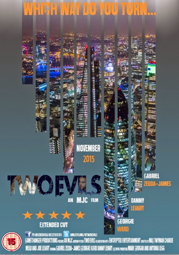
I decided to change the positioning of my title for the front cover of my poster as I wasn't completely fond of it at the top in between the city filled lines. I much prefer the new positioning but was not engaged by the colouring of the title on top of the blue gradient background. Due to this, I decided to add an image from our trailer (moment between Gabriel's character and our female character), which is one of my favourite shots from the trailer into the background of the writing. I much prefer this compared the block orange title I was using before, because it is more engaging and relevant as to our trailer, creating that link in our production package.
I also decided to change the arrangement of our main actors names in order to again make the poster more exciting and engaging for the audience. I again, much prefer the new positioning as I think they work nicely just below the city filled lines above.
I decided to place a tagline from our trailer at the top of the poster where the film title was originally placed. The tagline was lifted straight from our trailer where it can be seen in the montage with the font/colouring changed in order to the fit the style of my poster. This also links the two products together well creating verisimilitude which is necessary for a movie trailer/poster release.
I've also begun to add the necessities in different places around the poster in order for it to be more visually engaging and also to adhere to the criteria needed for a movie poster.
This is how it is looking thus far. Overall I am pleased with how it is turning out.
MT
Thursday, 5 February 2015
Poster - constructing
I wanted to create a poster similar to the style seen in 'Welcome to The Punch', which is our main influence. I first started by creating a base colour which I liked and wanted to work on top off. I decided to make it blue and I added a few effects, such as gradient overlay and a pattern overlay in order to make it more engaging, instead of simply using block blue colour.
I then decided that I wanted to create an interesting effect using lines being drawn down the poster cover. I decided to play around with the different line formations until I found something that I liked, again using 'Welcome to The Punch' as an influence. I also decided to switch my canvas by 90 degrees as I felt it suited the style I was going for more closely.
After finding the right configuration of lines, I decided that I wanted to add something (a picture of some sort) in the background of the lines in order to make them more engaging for an audience. I wanted to use an image of the city but seeming as I haven't yet had the chance to properly take a picture that I like, I decided to use a found image to represent what it would actually look like. This part was particularly difficult as I am not hugely confident on Photoshop but after much work, I am pleased with how it turned out.
I decided to add some spotlight brushes at the top of the poster just above where I wanted the title to be placed, in order to highlight the name of our film in a more interesting and engaging way.
I then decided to add the title plus initial names of our main three actors in the film like most conventional crime/thriller posters. I used the same font as seen in our trailer narrative moments in order to provide that link between film and poster and also adhere to the conventions of how film packages are released. I also placed the certification for our trailer in the bottom left-hand corner. Although I am still deciding where I want the certification to be placed before the deadline for this task.
MT
Sunday, 7 December 2014
Saturday, 6 December 2014
Friday, 5 December 2014
Film Poster Research - The Godfather
The colour scheme of The Godfather poster is typical of films of
the genre. The use of null colours, with no texture nor shade in
combination with the contrasting reds, whites and blacks suggests
conflict between two clear cut sides of a strife with the blood red
shade of the mans face emphasising this. There are also suggestions
of old vs new, again highlighted by the contrasting colour scheme of
the poster. The elder is seen as more powerful, due to the use of
puppet strings over the title of the film. Puppet strings are often shown
as signs of manipulation and power, both themes central in the film.
There are alternate posters for the film "The Godfather", one of which
showing a shaded character with a rose in his pocket. Of a similar
colour scheme and nature of this poster, we can also reference
the connotations of the rose in film. Showing passion and an
ability to love, but it is also commonly viewed that roses have a
more negative connotation, seen from their thorns. Again representative
of the film, something beautiful and powerful can also have a dark
side and being the only object of the colour, this darker side is
emphasised. Finally, the lack of clarity and definition of the
poster reflects the film itself, with hierarchy's of power constantly
being challenged.
The anchorage of this poster of "The Godfather" is of major importance
for a first time viewer of the film. Without it, one would imagine a comic
book, possibly of Marvel's darker section with the black and red dominating the poster.
With the text however one realises that the poster actually represents a film, shown through "Paramount Pictures
Presents" which not only shows the poster as advertising a film but also attempts to entice fans of the
production company Paramount to see the film. There are also connotations in the text of the poster,
with "The" godfather suggesting an unparalleled power, and a godfather which everyone knows about. The word "Godfather" itself has previous Mafia links and is reflected in the film, however it also suggests a link between the viewer and the
Godfather, enticing the reader further. Finally, the font of the poster title seems expressionistic yet
clean, again reflecting the contents of the film.
The tone of the poster, and in turn film, is a dark one. With the dominating colour being black there is a
negative and sinister tone suggested through the colour scheme. There are also suggestions of conflict
and blood through the blood red colour of the dominant figure in centre shot. There are also levels of
formality which are implied through the poster, as previously mentioned the use of "The" instead of "A"
or an alternate phrase suggests a familiarity and power which is unrivalled. Through the facial expression
and positioning of the man in centre shot, we can also see that the poster takes a dejected, solemn tone
which again is reflected in the colour scheme.
There are no intertextual references as such, however the "Paramount Pictures Presents" takes part of
the viewers focus away from the poster and to the production company. This becomes more and more
important in the two sequels of The Godfather as it links them to the previous films through title and production
company.
The target audience of the poster is relatively obvious. The dark, sinister use of black and red with the film
being an 18 itself closes the target audience off from the bottom end of the most typical film market (15-24) and
opens the film up to more adults, suggesting a maturity about the film and connoting themes which only the
elder generations can understand. It is also directed at a primarily male audience, with the person in the position
of power in both the title and poster being a man. It also sells itself to a fan of good film, with a minimal
poster suggesting the majority of the marketing to be done in hype around the film itself.
There are no obvious ideologies in the poster, simply due to the lack of character definition in the poster and the null
colours. Through knowing the film, one can suggest that through the lack of vibrancy and emotion in the poster the
gang/mob life is looked down upon as not always coming out on top, which is slightly emphasised through the facial
expression of the man on the poster.
JL
the genre. The use of null colours, with no texture nor shade in
combination with the contrasting reds, whites and blacks suggests
conflict between two clear cut sides of a strife with the blood red
shade of the mans face emphasising this. There are also suggestions
of old vs new, again highlighted by the contrasting colour scheme of
the poster. The elder is seen as more powerful, due to the use of
puppet strings over the title of the film. Puppet strings are often shown
as signs of manipulation and power, both themes central in the film.
There are alternate posters for the film "The Godfather", one of which
showing a shaded character with a rose in his pocket. Of a similar
colour scheme and nature of this poster, we can also reference
the connotations of the rose in film. Showing passion and an
ability to love, but it is also commonly viewed that roses have a
more negative connotation, seen from their thorns. Again representative
of the film, something beautiful and powerful can also have a dark
side and being the only object of the colour, this darker side is
emphasised. Finally, the lack of clarity and definition of the
poster reflects the film itself, with hierarchy's of power constantly
being challenged.
The anchorage of this poster of "The Godfather" is of major importance
for a first time viewer of the film. Without it, one would imagine a comic
book, possibly of Marvel's darker section with the black and red dominating the poster.
With the text however one realises that the poster actually represents a film, shown through "Paramount Pictures
Presents" which not only shows the poster as advertising a film but also attempts to entice fans of the
production company Paramount to see the film. There are also connotations in the text of the poster,
with "The" godfather suggesting an unparalleled power, and a godfather which everyone knows about. The word "Godfather" itself has previous Mafia links and is reflected in the film, however it also suggests a link between the viewer and the
Godfather, enticing the reader further. Finally, the font of the poster title seems expressionistic yet
clean, again reflecting the contents of the film.
The tone of the poster, and in turn film, is a dark one. With the dominating colour being black there is a
negative and sinister tone suggested through the colour scheme. There are also suggestions of conflict
and blood through the blood red colour of the dominant figure in centre shot. There are also levels of
formality which are implied through the poster, as previously mentioned the use of "The" instead of "A"
or an alternate phrase suggests a familiarity and power which is unrivalled. Through the facial expression
and positioning of the man in centre shot, we can also see that the poster takes a dejected, solemn tone
which again is reflected in the colour scheme.
There are no intertextual references as such, however the "Paramount Pictures Presents" takes part of
the viewers focus away from the poster and to the production company. This becomes more and more
important in the two sequels of The Godfather as it links them to the previous films through title and production
company.
The target audience of the poster is relatively obvious. The dark, sinister use of black and red with the film
being an 18 itself closes the target audience off from the bottom end of the most typical film market (15-24) and
opens the film up to more adults, suggesting a maturity about the film and connoting themes which only the
elder generations can understand. It is also directed at a primarily male audience, with the person in the position
of power in both the title and poster being a man. It also sells itself to a fan of good film, with a minimal
poster suggesting the majority of the marketing to be done in hype around the film itself.
There are no obvious ideologies in the poster, simply due to the lack of character definition in the poster and the null
colours. Through knowing the film, one can suggest that through the lack of vibrancy and emotion in the poster the
gang/mob life is looked down upon as not always coming out on top, which is slightly emphasised through the facial
expression of the man on the poster.
JL
Film Poster Research - Raiders of the Lost Ark
The iconic whip, as well as a sword and gun, suggest that this is a film involving a lot of action and adventure, with
the imagery of the Ark and temple bring in the idea of antiquities, archaeology and ancient civilisations. This is also
suggested by the golden colouring of the poster (emanating from either Harrison Ford or the Ark), which suggests
value to the artefacts and lends even more of the adventuring atmosphere. The numerous faces and their expressions
connote various things about their characters, such as the 'damsel in distress' figure of the dark haired woman, or the
shadowy ominous figure of the bespectacled nazi. These faces, the weaponry, the stance of Ford, the snake, the
burning at the stake image, and the imagery of archaeology, all paint 'Raiders of the Lost Ark' as a proper, adventurous,
thrilling outing.
'The Return of the Great Adventure' is an interesting strapline as it both suggests a harkening back to an older style
of cinema, where adventurers and goodies vs baddies was more common, but also a new spin on the style, which
could appeal to both older and younger audience. The title is reminiscent of an old comic book title or of a
Douglas Fairbanks Jr film, as well as being exciting and intriguing, which links back to the idea of a 'revisiting'
of the adventure genre.
Harrison Ford, with his buttoned down shirt, active stance, raised weapon, and Eastwood-esque headgear, is the
classic adventure hero, fending off the heinous nazis with one hand back to protect both the story's heroine, and
the Ark. The tone of the poster is thrilling and action packed with a lot to take in, whilst still retaining an emphasis
on the characters and features of the film itself. The nazis are all straight-faced and solemn, a sense of formality
surrounding them and contrasting with the not-altogether-groomed look that Ford is sporting, clearly painting him
as the anarchic and free thinking hero to battle the authoritarian nazi antagonists. The tone of the poster is compliant
as such, with a playful and fun spirit behind it that is combined with the thrilling and active imagery of adventure.
There is reference to the older genre of adventure films in the poster, and many of its hallmarks are drawn on.
Obviously nazi and obviously middle eastern figures appear, a feature of the more conservative nature of
earlier Hollywood cinema, and the poster's style of art and arrangement is distinctly evocative of film posters of that era.
The film is obviously directed at a younger male audience, with the poster featuring stereotypical 'hero' and
'damsel' figures, and presenting a sense of morality that is simpler and more 'black and white'. The attractive
female and aspirational male are obviously directed at a certain gender. In terms of age, the genre would
traditionally appeal to younger consumers, although there is an attempt to be more 'catch all' in the revisiting
of an older genre and the angle that that is directed in.
In terms of representation, all but one of the figures appearing on the poster are men, all but two are white, and
all but three are white men. The woman is in a submissive, frightened pose that depicts her as the 'damsel' figure
who needs protecting by the manly Ford. The two middle eastern men on the poster are not central to the plot
particularly and can thus be viewed as having been put in the poster as 'curiosities' to make the film seem more
exotic or adventurous. This, paired with the depiction of the evil nazi German antagonists could give an air of
xenophobia to the poster.
The poster is very effective at conveying genre and character through colours, figures, and imagery. It draws in
a wide audience with promises of excitement and adventure whilst remaining a sophisticated and eye catching
piece of advertising.
CM
Road to Perdition - Movie Poster Research
Connotation - The visual image of the father and son wearing similar clothes and holding hands connotes this idea of a family bond, which is central to the main theme of the film itself. Tom Hanks holding the Gun and the shadow covering half of his face suggest something different and create mystery around the poster. This links into the Film Noir style that the poster is clearly trying to connote. The rain splattering across the poster also creates a powerful image. You can almost hear the rain, which connotes the idea of the family bond as aforementioned being broken, which is a major part of the film, due to the fact that the son witnesses what his father (Tom Hanks) does for a living. The film noir style of this poster is certainly shown through all the visual images presented to the audience. (shadowy image of Tom Hanks character and his son with the street lights in the background).
Anchorage - The Anchorage, despite being minimal in terms of actual text on the poster, it is certainly effective in that it almost gives reason to the picture of Tom Hank's character and his son. "Pray for Michael Sullivan" suggests that Tom Hank's character will experience many problems throughout the trailer and with the words placed above the 'Tommy Gun' again suggest that the problems he will face will be particularly dangerous. The Bold Gold text spelling out "Road To Perdition" also heightens the situation, which is clearly shown through the image in the background. It gives a sense of importance to the two characters on the poster and almost forces the audience to notice the bankable actors names just above the title of the film.
Tone and Register - The tone on this poster is certainly quite dark and mysterious as shown by the Film Noir style. The long coat and trilby hat working in collaboration with chiaroscuro effects undoubtedly create a mysterious tone and link with one of the major themes of the film itself, Betrayal. The Dark tone is accentuated by the shadow image of the Gun in the bottom left hand corner and the rain splattering across the poster. They work well to create a moody atmosphere and link in with the text as aforementioned.
Intertextual References - "from the director of American Beauty" - This informs the audience on the style of film they are looking at and might create a wider audience as fans of that particular director might want to see the film for this reason. The institutions are also placed on the poster to again attract the audience to see the film as they would recognise the companies producing and distributing the film.
Target Audience - The target audience for this film is certainly focused on the larger male audience. This is because Tom Hank's character is clearly a father figure, which would attract a male audience. Also, it is clearly a gangster style movie as clearly shown by the 'tommy gun', which again would be seen to please the male audience more. However, the theme of family values as shown by the two characters holding hands, could attract a female audience. Woman may also be attracted to watch the film by the names of some of the stars featuring in the film, such as Jude Law. However, the film is clearly aimed at a larger male audience.
Representation - The dangerous world of gangsters is clearly represented through the dark imagery of the father holding hands with his child whilst holding a 'tommy gun' in his other hand. This could represent the fact that once someone has become involved in that lifestyle, then everyone around you becomes affected, even your children. It's particularly powerful as the innocent image of the child, who appears to be dressed in a similar way to his father, has been caught up in the dangerous lifestyle of his father. The fact that you cannot see the boys face is also powerful as it represents this image of a loss of hope, which is counter-acted by the shining lights in the background of the image.
Effect and Effectiveness - This poster is undoubtedly effective as clearly shows the major themes f the film itself, which are Family Values and Betrayal (Shown by holding hands and Gun, coupled with film noir style and the rain). The anchorage is also effective as it enforces the themes of the movie, by implying that Tom Hank's character and his son are on their own in the movie and have little help from the people around them.
MT
Anchorage - The Anchorage, despite being minimal in terms of actual text on the poster, it is certainly effective in that it almost gives reason to the picture of Tom Hank's character and his son. "Pray for Michael Sullivan" suggests that Tom Hank's character will experience many problems throughout the trailer and with the words placed above the 'Tommy Gun' again suggest that the problems he will face will be particularly dangerous. The Bold Gold text spelling out "Road To Perdition" also heightens the situation, which is clearly shown through the image in the background. It gives a sense of importance to the two characters on the poster and almost forces the audience to notice the bankable actors names just above the title of the film.
Tone and Register - The tone on this poster is certainly quite dark and mysterious as shown by the Film Noir style. The long coat and trilby hat working in collaboration with chiaroscuro effects undoubtedly create a mysterious tone and link with one of the major themes of the film itself, Betrayal. The Dark tone is accentuated by the shadow image of the Gun in the bottom left hand corner and the rain splattering across the poster. They work well to create a moody atmosphere and link in with the text as aforementioned.
Intertextual References - "from the director of American Beauty" - This informs the audience on the style of film they are looking at and might create a wider audience as fans of that particular director might want to see the film for this reason. The institutions are also placed on the poster to again attract the audience to see the film as they would recognise the companies producing and distributing the film.
Target Audience - The target audience for this film is certainly focused on the larger male audience. This is because Tom Hank's character is clearly a father figure, which would attract a male audience. Also, it is clearly a gangster style movie as clearly shown by the 'tommy gun', which again would be seen to please the male audience more. However, the theme of family values as shown by the two characters holding hands, could attract a female audience. Woman may also be attracted to watch the film by the names of some of the stars featuring in the film, such as Jude Law. However, the film is clearly aimed at a larger male audience.
Representation - The dangerous world of gangsters is clearly represented through the dark imagery of the father holding hands with his child whilst holding a 'tommy gun' in his other hand. This could represent the fact that once someone has become involved in that lifestyle, then everyone around you becomes affected, even your children. It's particularly powerful as the innocent image of the child, who appears to be dressed in a similar way to his father, has been caught up in the dangerous lifestyle of his father. The fact that you cannot see the boys face is also powerful as it represents this image of a loss of hope, which is counter-acted by the shining lights in the background of the image.
Effect and Effectiveness - This poster is undoubtedly effective as clearly shows the major themes f the film itself, which are Family Values and Betrayal (Shown by holding hands and Gun, coupled with film noir style and the rain). The anchorage is also effective as it enforces the themes of the movie, by implying that Tom Hank's character and his son are on their own in the movie and have little help from the people around them.
MT
Thursday, 4 December 2014
The Conjuring - Movie Poster Research
Connotation - The significance of the Rope hanging from the shrivelled tree in front of the large 'haunted' looking house introduces the horror/thriller genre. The rope connotes death, which will obviously play a major part in the film and links together the idea of death and haunting, which again is a major theme of this horror movie. The black block letters spelling out 'The Conjuring' placed against the mirky white background of the sky also connotes this idea of good vs evil as shown through the contrasting Black and White. Death is the major theme present on this movie poster and this is backed up by the image of the shrivelled tree, which represents the loss of life and hope, which are again major themes of the film itself. After looking at the poster, we as the audience, undoubtedly understand the message of the people who created it through connotation.
Anchorage - "Based on the true case files of the Warrens" - This certainly effects the way the poster is viewed as an audience member and is often used in Horror Movies to attract the audience and cause them to feel more scared of the events in the film itself. This causes the audience to be more likely to believe the events in the film and thus feel terrified when watching it. It is important to put this on the film poster itself as it will attract more people to watch the film at the cinema when it is released. "If it is based on a true story, the film instantly becomes more scary" - This is the idea behind why this line is placed on the movie poster.
Tone and Register - The tone of the poster is clearly one of death and decay as shown by the shrivelled tree and the old wooden built house in the background. You know straight away that this is a poster promoting a horror movie due to the dark undertone, as shown by the central hanging rope representing death.
Intertextual references - "From the Director of Saw and Insidious" - lets the audience know what type of film they are likely to be going to see as they can base their opinions on these previous films mentioned. This certainly attracts the audience to watch a certain film, because if they enjoyed either, 'Saw or Insidious', then they are more likely visit the cinema and watch the film. The institutions are also referenced, which is also important as the audience will familiarise themselves with these well known institutions and perhaps be more likely to go and watch the film.
Target audience - The intended audience for this movie would undoubtedly be horror movie fanatics or people who are looking for a thrill. It is mostly aimed at an audience between the ages of 15-23, who are more likely to travel to the cinema with a group of friends or even a date to watch a scary movie. Judging from the poster, the target audience would be more likely to be a male audience between the ages of 15-23 as they follow the stereotype of, 'Being harder to scare'. Having said this, a female audience is still targeted, but the focus for most horror movies is usually placed on the larger male audience as they will often bring a woman with them to watch a horror movie.
Representation - the poster clearly plays on the stereotypes of most horror movies, with the large bedraggled house in the background representing this idea of a haunted house and a family being haunted by an unknown presence as represented through the image of a shadowed figure in the foreground of the poster. Despite the clear representation of death on the movie poster, the small glimmer of light appearing over the top of the house could be seen to represent this idea of hope and that good will prevail.
Effect and Effectiveness - This movie poster is undoubtedly successful in getting across the genre of film through the images it presents the audience with. It is evident that it is a poster promoting a horror movie almost as soon as you glance at it, due to the choice of images (large house, rope, tree) and the dark, almost gloomy colour chosen for the background. The poster could possibly be more successful if their was a phrase or line inserted to attract the audience to think in more depth about the poster and in turn create a wider audience for the film. However, in terms of attracting an audience, this poster is certainly effective as it attracted me to want to travel to watch the film.
MT
Anchorage - "Based on the true case files of the Warrens" - This certainly effects the way the poster is viewed as an audience member and is often used in Horror Movies to attract the audience and cause them to feel more scared of the events in the film itself. This causes the audience to be more likely to believe the events in the film and thus feel terrified when watching it. It is important to put this on the film poster itself as it will attract more people to watch the film at the cinema when it is released. "If it is based on a true story, the film instantly becomes more scary" - This is the idea behind why this line is placed on the movie poster.
Tone and Register - The tone of the poster is clearly one of death and decay as shown by the shrivelled tree and the old wooden built house in the background. You know straight away that this is a poster promoting a horror movie due to the dark undertone, as shown by the central hanging rope representing death.
Intertextual references - "From the Director of Saw and Insidious" - lets the audience know what type of film they are likely to be going to see as they can base their opinions on these previous films mentioned. This certainly attracts the audience to watch a certain film, because if they enjoyed either, 'Saw or Insidious', then they are more likely visit the cinema and watch the film. The institutions are also referenced, which is also important as the audience will familiarise themselves with these well known institutions and perhaps be more likely to go and watch the film.
Representation - the poster clearly plays on the stereotypes of most horror movies, with the large bedraggled house in the background representing this idea of a haunted house and a family being haunted by an unknown presence as represented through the image of a shadowed figure in the foreground of the poster. Despite the clear representation of death on the movie poster, the small glimmer of light appearing over the top of the house could be seen to represent this idea of hope and that good will prevail.
Effect and Effectiveness - This movie poster is undoubtedly successful in getting across the genre of film through the images it presents the audience with. It is evident that it is a poster promoting a horror movie almost as soon as you glance at it, due to the choice of images (large house, rope, tree) and the dark, almost gloomy colour chosen for the background. The poster could possibly be more successful if their was a phrase or line inserted to attract the audience to think in more depth about the poster and in turn create a wider audience for the film. However, in terms of attracting an audience, this poster is certainly effective as it attracted me to want to travel to watch the film.
MT
Subscribe to:
Posts (Atom)