Thursday, 5 February 2015

Poster - constructing

I wanted to create a poster similar to the style seen in 'Welcome to The Punch', which is our main influence. I first started by creating a base colour which I liked and wanted to work on top off. I decided to make it blue and I added a few effects, such as gradient overlay and a pattern overlay in order to make it more engaging, instead of simply using block blue colour. 


I then decided that I wanted to create an interesting effect using lines being drawn down the poster cover. I decided to play around with the different line formations until I found something that I liked, again using 'Welcome to The Punch' as an influence. I also decided to switch my canvas by 90 degrees as I felt it suited the style I was going for more closely.


After finding the right configuration of lines, I decided that I wanted to add something (a picture of some sort) in the background of the lines in order to make them more engaging for an audience. I wanted to use an image of the city but seeming as I haven't yet had the chance to properly take a picture that I like, I decided to use a found image to represent what it would actually look like. This part was particularly difficult as I am not hugely confident on Photoshop but after much work, I am pleased with how it turned out.


I decided to add some spotlight brushes at the top of the poster just above where I wanted the title to be placed, in order to highlight the name of our film in a more interesting and engaging way. 


I then decided to add the title plus initial names of our main three actors in the film like most conventional crime/thriller posters. I used the same font as seen in our trailer narrative moments in order to provide that link between film and poster and also adhere to the conventions of how film packages are released. I also placed the certification for our trailer in the bottom left-hand corner. Although I am still deciding where I want the certification to be placed before the deadline for this task. 


MT

Sunday, 1 February 2015

Magazine Front Cover - Social Media

We decided to upload images of our magazine to both Instagram and our Facebook page in order to gain audience research/opinions on the front cover. This way we could improve our front cover, based upon the opinions of people who commented. It was also useful to keep up to date with our target audience and make sure that our magazine cover was hitting the aims of our production. 


Instagram:


MT

Thursday, 29 January 2015

Magazine Cover - Details

I wanted to make some of the 'specials' stand out and saw that Empire often added a low opacity box around their 'specials' in order to make them stand out to the readers/audience. I decided to do something similar, as seen below, whereby I created a grey box and lowered the opacity in order for it to stand out in comparison to the background but not crowd out the words above it. I then Layered the text above it and moved it to size. It created the effect that I was looking for, which was pleasing. 


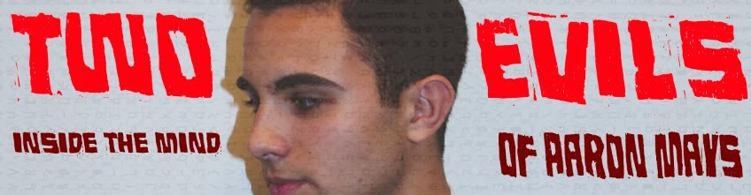
I also decided that I needed to change the colour of my film title slightly and so decided to keep the powerful 'Two' and 'Evils' in bright block red but changed the subtitle to a much darker burgundy. I felt that this balanced the overall look to my magazine, which is essential for it's success. 


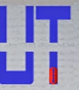
I wanted to add some sort of logo and was set on the idea of using an image of a razor-blade to fit with the 'Extended Cut' masthead. I placed the razor blade image all over the magazine and even attempted to add a line of them through the already visible cut in between the top and bottom layer of 'extended cut'. In the end, I decided to change the colour of the razor-blade and tilt it so it would fit into the 'T' at the end of my magazine title/name. 


MT

Tuesday, 27 January 2015

Magazine Cover - working progress


Below are a few photos showing the progress of my magazine cover, with the different puffs, square blocks added carefully and placed in a particular spot on the front page, where I believed they looked best. I am fond of the slick, sharp feel to most empire magazines and so wanted to replicate this in mine. I was also influenced by the 'coding' from media magazine and so attempted to do something similar as seen by the faint coding travelling down the background layer of the magazine. The blue title was also included in order to outline where my masthead would be placed. I particularly like the the red puffs in the bottom right corner, combined with the black and white writing as I think it creates quite a striking effect. I think the central image is extremely striking and works with the grey/white background colour to my magazine.


Progressing: I placed the 'Two Evils' title almost all over my magazine cover before finally deciding to place it either side of Gabriel's head. I wanted to do this from the start but was trying out different placings before I went with my original idea. I like this placing due to the fact that it fits with the connotation of the title itself. Our film plays around with the theme of split-personalities and this is highlighted through the broken placing of 'Two' and 'Evils'.


Progressing:


I decided to place the CMYK mask just below the title of my magazine front cover as I was strongly influenced by many of Empire's magazine covers, who place a small red 'plus-sign' on their magazine cover to signify that it is their very own front cover. I also thought it worked within the style of the magazine itself. All that was left for me to do here, was to change the colour of 'Two' and 'Evils' in order for them to stand out compared to the brighter, more block red of the magazine.

I was having particular trouble with the masthead for my magazine cover, mainly due to the fact that I was short of ideas. I wanted to play around with the idea of using a razor blade in order to link in with the title of my magazine, which is 'Extended Cut'. Another idea I had was to have the two words on a different level in order to show that it looked like they had been 'cut'. I will keep playing with it until I find something that I think works well with the rest of the magazine cover.


I decided to split the words 'Extended Cut' in half in order to represent this idea of the 'cut', which is a term used in film on a regular basis. Below is the end result…


MT

Media Magazine - Progress

We decided to take a few photos of our main actor (plus us, as the directors for Charlie's magazine) in order to insert these images into Photoshop and then play around with them. We wanted to play around with a few different images in order to increase our chances of finding one we particularly like. Below, you can see two different sets of images of Gabriel in the editing stage of Photoshop. As you can see I played around with the different colours, their transparency and saturation in order to find the desired effect. I particularly like the first image below and decided to use it as the central image to my magazine, which is influenced by the famous 'Empire' Magazine. I also enjoyed using tools such as spot removal in order create a completely clean-looking face, similar to that of modelling photos on the front cover of a magazine.


As you can see below, I decided to play around with the different levels of brightness, temperature and vibrance in order to make the central image more powerful. I decided to play around with the different colourings as well but landed on this image below and felt it was the perfect fit for my magazine front cover. 


I originally wanted to split the central image and have Gabriel looking both ways on the front cover, but after much deliberation, I decided that it would probably be a better idea to attempt this for the poster, instead of the magazine. 


MT