Saturday, 15 November 2014

Influence & Title Ideas


 My biggest influence in the way our titles ought to look is 'Hummingbird'. Our intent with
 the trailer is to contrast an intense montage with a slower paced shot of London, followed 
by the title and preceded by a sound boom. This requires an impactful but not entirely 
dynamic title. The 'Hummingbird' title uses a simple, sans serif typeface in a slightly 
yellower shade of white, with wide letter spacing giving the otherwise tame sounding 
title a sort of ominous gravitas. It appears on a green/blue darker background that is evocative 
of smoke or space. This is a highly effective use of a title card, with minimal animation but
 strong graphical design, making something of it's kin a viable option for us to use and design in 
our trailer.

We have been for a while stuck in terms of an actual name for our film. 
My suggestion has been 'Two Evils'. This title fits with our narrative 
as the protagonist must  choose the lesser of two evils (the evils being
 the main bad guy and the police chief, both of whom want to kill or arrest him). 
It is also reminiscent of films similar to ours with titles appropriate to the
 plot whilst being outwardly fairly vague, such as 'Eastern Promises' 
and 'Welcome To The Punch'.

One of the downsides to this title may be its vagueness, although I 
feel this may conform to the genre and not really be an issue. However 
another issue may be that 'Two Evils' is reminiscent of a different 
genre - namely Horror. Films like 'Drag Me To Hell' and 'Deliver Us From Evil'
 are solidly within the boundaries of the Horror genre, but similarly
 to 'Two Evils', use expressions or quotes in their titles, as well as 
terminology that suggests the demonic, satanic side of the Horror genre.

In any case, Two Evils' is my proposal for our film title, despite its 
possible Horror connotations. I remain open to any other suggestions

 from the group, as I do acknowledge the title is not perfect.

CM

Title Influences

The title card of our film will be an important way to signify genre and tone, and can be used as a way to catch the eye of the trailer-watching audience.


I posted earlier in the year about intertitles.tumblr.com, a blog which routinely posts a selection of title cards across a range of genres. This will be useful to us for deciding the sort of aesthetics we like, as will artofthetitle.com, a similar website that posts selected screenshots from the openings of films, including their title cards. In the post about Intitles I included a collage of titles I particularly liked, and this can be seen above.

Titles that are of a similar style or genre to ours that are shown on Art of the Title include Fight Club, True Detective, and Casino Royale. These three title cards are punchy and relatively simple whislt still being relevant to the film and reflecting its style, which really ought to be a key point of an effective title.

Our specific influences also can provide inspiration and influence us in our design, especially pink and blue colour schemed films like Only God Forgives, Hummingbird, and Welcome To The Punch. Although Only God Forgives is slightly further from what we would like to pursue than the other two, its colours and boldness can be learned from as an example. The Hummingbird and Welcome To The Punch titles are similar both to each other, and to what we would like to achieve. Both are bold, would serve us well in our dramatic title reveal, complete with sound boom, and have colours and fonts reflecting accurately the tone of the films they belong to.


CM

Narrative Graphics

Narrative graphics are the black screen's usually accompanied by text which are shown throughout a 
trailer in order to enhance the storyline and allow the narrative to become clearer. Such examples
 of this come from Redemption, previously named Hummingbird, stating "Time to heal" 
and "A second chance" on two separate occasions. In conjunction with the shots shown, this tells us 
where the narrative is going and the tone of the film. By using relatively passive narrative graphics, 
instead of something along the linesof "Know your enemy" from Welcome to the Punch,
 one can infer that the tone will take a more emotionally based setting and there will be 
a lot more focus on the character and his relationships. Some examples of possible 
narrative graphics are shown below, which were made in one double period by yours truly.


The use of smoke in both narrative graphics board was inspired, once again, by Welcome to The
Punch.The white and grey blocks in the background show that the middle is transparent, leaving 
us to find amoving motion picture or video, either shot by us or taken from a  non copyright
 website. The different colours, red and light blue, are the most prominent colours in 
our film and bear connotations of danger, desire and high budget films. Although not finalised, 
the textual content of the graphicscomes from the idea of both the police and the
 underground gangs chasing our main character.


We found that the idea of having passive, still smoke on the narrative graphics looked
too amateur however and as such changed it to show more technical ability. Using Motion,
 we created overlays, one of which utilised the using the effects "Embryo" with other effects
such as blurs, and then animated to have it moving across the screen. Incidentally this overlay
 was also used in our ident due to how well it turned out. An example with the overlay on a
black background can be shown below, as well as the motion settings which were used.


The Example:


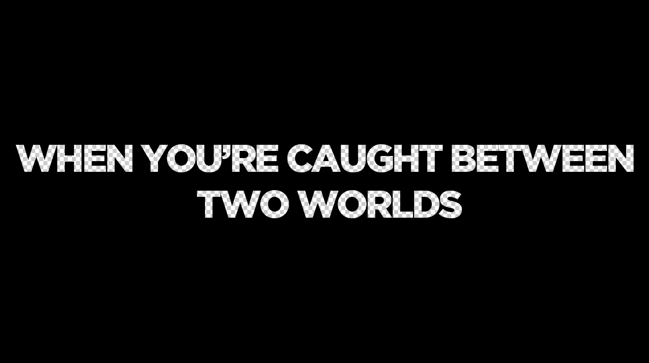
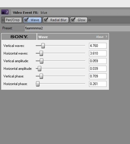
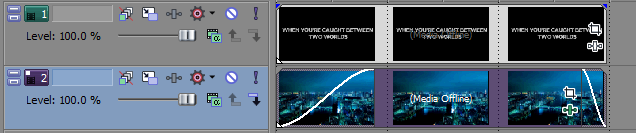
The two above narrative graphics are shown below without added effects from motion and
 how they were composed using Sony Vegas 12. This was done through using the effects Motion Blur, 
Wave and Colour Correction underneath a black rectangle with the text cut out which was done in 
Photoshop (The second graphic down comes first)


Our final narrative graphic comes from inspiration found in Hummingbird. Although not exactly 
a narrative graphic as it does not extent the story, as such, introducing previous films which the
 directors have made is an essential part in raising awareness of the trailer. Because of this we 
created a background on Photoshop, made up of various layers of non-copyrighted images and
 including a picture of a sunset I took while in Greece. This was then overlaid 
with "From the Director's of" and either "Existence" or "The Shadow Man" depending on 
which shot it was going to be for. These were then assembled on Sony Vegas, again 
utilizing the Wave and Glow Video Effects to produce this graphic.


JL

Thursday, 13 November 2014

Narrative Graphics Influences


Welcome to The Punch - The narrative graphics used within Welcome to The Punch were a major influence of ours, as was the film itself. The blue on black which is shown so much within the trailer is reflected within the narrative graphics, showing phrases which enhance the narrative along with the colours used, bearing connotations of big city life and mainstream films. The graphics use a blacked out png file with transparent text in the middle which is then placed in to a video editing software, overlaying the png on top of a moving/animated still of a city which has effects added to it. There are then multiple light and smoke layers placed on top of the black screen, which connote mystery and add to the aesthetic effect of the graphics. There is a slight reflection of the text in certain areas of the blacked out background which shadow the moving image which animates the graphics, and the words get closer to the foreground of the screen as they go on. This highlights their importance as well as emphasising the technical skill needed to make it, bring the audience closer to the animated background and smoke overlays.

Only God Forgives - These narrative graphics are similar to Welcome to The Punch in their use of colour to bear connotations of the film, as well as their use to enhance the storyline. Apart from this, however, there is not much similarity at all. The use of dark red/neon colours throughout the film is reflected within these narrative graphics, connoting danger, lust, death and love. These are shown within the shots in the film, however the Oriental feel really comes out within the first two narrative graphics especially, showing these neon style text segments overlaying a traditional Samurai pattern on a paper wall. The final narrative graphics, which introduce the actors, don't replicate this use of traditional oriental design in the background and as such suggest something concerning the film, a sort of out of place-ness. The director is also introduced within the graphics, labelling himself as "Visionary"and referencing previous films he has done, of which Drive is his most famous. The fell of the graphics are very similar to the tone of drive, which can be seen later in the post, and as such builds up a fan base of stylised high budget crime thrillers. As previously, the text and background image come towards the audience, bringing them in to the film and increasing appreciation of the style of the film.

Hummingbird - The graphics within Hummingbird are very different to the previous two examples/influence. They prefer a clean and easily readable style which again connote things which are going to happen but are done much more plainly, perhaps referencing the lower class/dangerous background in comparison to the previous two examples. The text is a sans-serif font with an outer glow and written entirely in capitols on a black background, again utilising smoke and light overlays to stop the graphic looking completely plain. The fragmentation of the words, as can be seen in the first example, bears reference to the main characters past and in hindsight is a quirky and interesting touch on behalf of the director, which only the active audience members ail pick out. This is reflected within the fact that the text is not centred on the screen and enforced through the shots shown prior to and post-graphic, leading the audience to experience a complete feel for the film as something more than just a mindless Jason Statham action movie. As the pace of the film picks up, the overlays on the background become more and more vivid and the text becomes bolder and with a greater glow radius, showing how what is says is becoming more and more important.

Drive - These graphics are the most different from the previous three examples. Instead of being overlaid on top of a black background which has some form of effect on it they are overlaid on a panning ariel shot of the city. This would imply, along with the simplistic font and slight effects on the text, that what they are saying is more important than the connotations of knowledge of the city and sense of direction which come through. The reference to the actors Ryan Gosling and Carey Mulligan are therefore implied to be the films best selling points, along with the strong narrative which is established and the stylised and slightly Only God Forgives-esque neon/city feel. Because of this simplicity there is less to talk about due to the majority of the narrative telling being done within actual shots, and as such are not so much influences, but an option which we may be able to consider. We will probably not use this design however, as due to our lesser film making abilities, require the narrative graphics in order to enhance the narrative to a similar extent than our shots do.

Monday, 10 November 2014

Ident planning 2

Using original working title 'Gamechanger Films':

An Ident idea which I made in order to make the introduction to our trailer 
slightly more professional is that Gamechanger Films. With inspirations coming 
from companies such as 20th Century Fox and Lionsgate, shown right, we eventually 
chose a mixture of the clean font of Columbia and the clean black background of 
Universal as the main inspirations. This led us to choosing a font, a design and
 whether there was going to be anything in the background. The layer order, 
final design, font set up and effects used can be seen in the Photoshop screen
 grab below. 


Then came the animation, using Sony Vegas, to mix up the software from the 
previous ident using Motion, we took this idea of encoding from Encrypted entertainment 
and carried it over. Utilization of the TV simulator effect, as well as ready made effects
 used in motion and light flares allowed us to create an ident which both looks clean, 
professional, and resembles one usually seen professionally. It can be seen below. 
Sound may still be added, however a silent ident at the start of a tense film, if done 
correctly, has a majorly positive impact on the first act.


JL

Friday, 7 November 2014

Ident Planning

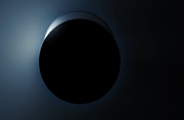
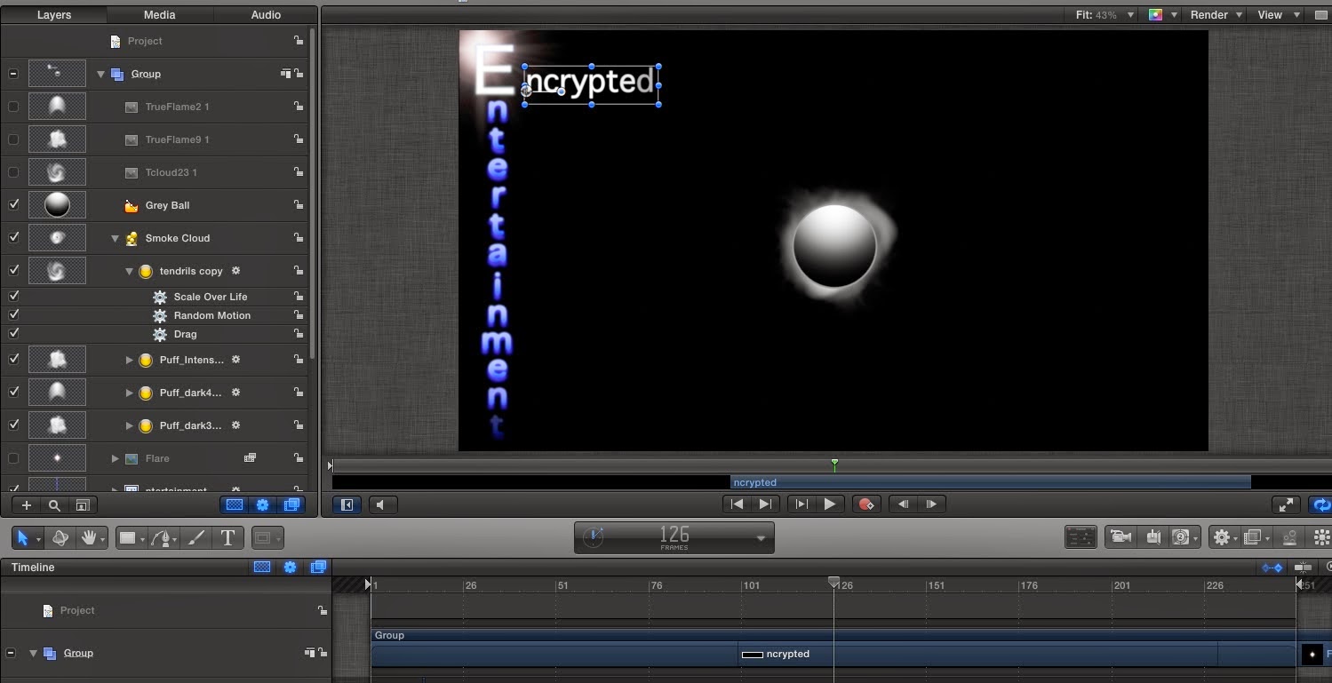
We have decided to entitle our production company 'Encrypted Entertainment' and use the influence of 'Entertainment One's' logo and moving ident. I particularly like the way they have the 'E' emerging from behind a black circle background and would like to create something similar for our ident:


The style is also extremely interesting as the light is almost emerging from behind the black circle like a flashlight, which I feel is not only unusual visually but also adheres to the thriller/crime genre of our trailer. Many companies, such as 'Alliance Films' who produce the sort of film we are looking to recreate employ an ident that follows a similar style to the 'Entertainment One' logo seen above/below:


Although I am fond of the movement of 'Entertainment One's' ident, I don't particularly like the finished logo and have been more strongly influenced by the end logo of 'Impact Pictures'. The colouring and choice of positioning for the titles is much more interesting and unusual and so I would like to use samples from both idents in order to make my own:


However, after much of my time spent on motion attempting to create an ident that was similar to our influences, we managed to make something, which was fairly similar but which we did not particularly like. We thus decided to go down a different route and actually link both the logo/moving image to the word, 'Encrypted'. Despite the initial failure of the ident here, the experience was still extremely useful for me as it allowed me to familiarise myself with Motion, in which I was not confident on before-hand. I am now much more confident when using it, which has been helpful. Below is the first Ident we made, which we are not happy with. We had the idea of closing the gap between the 'Encrypted Entertainment' and the circle in the middle but after some time spent on it, I couldn't manage to make something I liked enough to use as our finished Ident and so we decided to scrap this idea as a whole and use it as experience if not anything else.  


Motion was something we used last year for the AS course but was still something I was unfamiliar with and so I decided to take on this task in order to improve my skills on the technology. Despite the fact that the above Ident failed to work how I imagined it, I was still pleased with my overall work and confidence gain on motion, which was invaluable for the editing stage of our films:

MT