After creating our Facebook page, I decided to upload our animatic and we contacted a few of our friends/relatives to watch it and let us know what they think. After a few minutes we had already gained our first comment, which was both helpful and exciting, due to the fact that I felt our film was really beginning to take shape. It was useful for us to see that our film was already creating buzz/hype over social media despite the fact that this is on an extremely small scale in comparison to the professional companies who distribute films. It is important to us that we follow many of the normal steps that a 'properly produced' film would take and every film/production/distribution company working nowadays, due to the introduction of Web 2.0 uses social media to further extend the excitement around their particular film. I will most likely post a few more pictures of peoples comments/likes as they view and write them in the near future.
I also decided to add a few stills from the storyboard to my Instagram page in order to gain likes and interest in the trailer from my followers:
The amount of people viewing our animatic on Youtube is also steadily on the rise, which is a good sign due to the fact that we want to make our film/trailer accessible to everyone on social media.
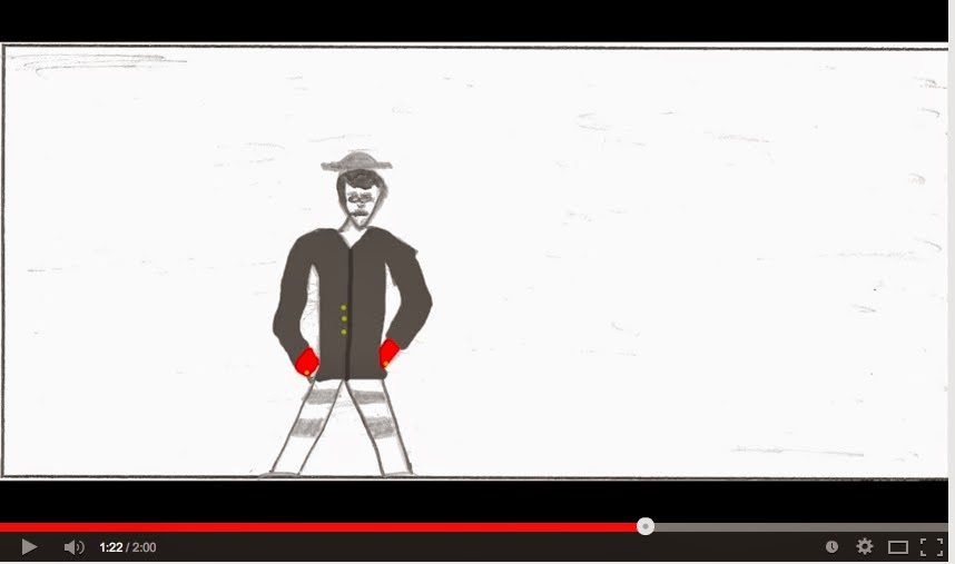
This is our finished Animatic, which is a collection of all the photos from our storyboard put together on Final Cut and sound, similar to that in our final trailer was added in order to show what our film will look like at the end of the process. Obviously it is difficult to completely understand the running of our film from these pictures but it certainly gives us a good idea of what it will look like and is exciting to see our film finally up and running in some way. We split each 'Act' into three sections and used Photoshop to colour in the photos. We then exported the photos and placed them into Final Cut and edited each section of the animatic individually to fit with the pace/style/tone of our film. We each edited our own sections (Joe - Act 1, Max - Act 2 and Charlie Act 3).
However, we all worked on all three sections individually when it came to sound and added our own foley sounds when necessary. For example, I added a couple of sound booms when the main Antagonist is first introduced to highlight his importance to the storyline (at this moment below)
Audience Feedback:
Positive:
clear narrative structure
clear sense of character/genre
Negative:
bit unclear in moments
two bosses? needs to be clear who is main antagonist and who is secondary.
We have been using Final Cut Pro over the past few days in order to produce our animatic. It has certainly been helpful to use Final Cut again after last years AS task and it has been useful playing around with the length of shots and sound in our animatic because it has prepared us for the final editing task. As seen in the screen-grab below we have been playing around with the effects (crop/transform/color) in order to familiarise ourselves with the workings of final cut once more and improve the quality of our animatic. We also experienced a problem with the colouring of this character below so, as you can see we exported the 'still' back to photoshop, changed the colouring and then imported it back into Final Cut. We then hid the initial clip and placed the new one below in order to keep the sound timing the same. This was important because we didn't have one continuous soundtrack throughout it would have been hard to re-adjust the sound back to levels we preferred it.
As you can see above ^^^^^, we were adding a few of the stills from our storyboard (4 pictures on the left) to our animatic and were playing around with length time for each shot.
^^^^^^^^
We decided to play around with the different sounds available at this point as seen above (explosion 5 & booming rumble). We wanted to create a 'sound boom' effect at this point and so decided to sample a few different sound effects until we came across 'Booming Rumble', which was the closest towards the sound boom we could possibly find. We also played around with the sound fading up and down at the end/start of each section of sound in order to improve the quality of the sound boom.
^^^^^
We again decided to use 'Booming Rumble' because it sounded extremely similar to the 'Sound Boom' effect we see in most of our film influences.
This is our facebook page, whereby we will be uploading different parts of the trailer building process for the wider audiences on social networks to see. We also have a twitter page (@encryptedltd), whereby we will be doing a similar thing.
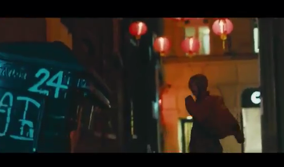
0.01secs - sound boom to start the opening shot of the city skyline (London). Typical way to start many crime/thriller trailers as it instantly places you into the action of the film. Juxtaposed well with the blue/neon lights on screen as it creates this sense of danger/crime but also gives the film a glossy look. We know instantly that the budget of the film is fairly high due to the slick, well controlled lighting and sound boom followed by the non-diegetic sirens over the top of the city landscape (similar to Hummingbird).
0.03secs - (Foley) constant ticking sound, which is used to great effect in this trailer as it creates tension amongst the audience, which is essential for a crime/thriller trailer and so the 'WTTP' trailer is adhering to the desired genre. It works in conjunction with the action on screen as it is suggesting that some sort of 'deal' is going to take place and that time is an issue. The ticking noise keeps the audience guessing as to what is going to happen next and is something we would like to use in our trailer in order to enhance the overall quality.
0.05secs - The ticking noise is also used alongside a sci-fi style soundtrack that increases in volume whenever we begin to see more action on screen. The sci-fi noise works particularly well with the close up of the 'bad guy' wearing a compromising mask and carrying a bag, which is clearly something illegal. It also keeps the tension and sense of danger in the scene extremely well as we are unsure of who the 'bad' characters are and what they are about to do.
Sci-Fi soundtrack - high cord increasing in volume.
0.07secs - Voice over used at the start of the trailer over the top of action. We would like to play with the idea of using both visual and non-visual verbal sound in our trailer in order to create differing effects. I particularly like the use of voice over in this part of the trailer as it works well in conjunction with the shots on screen of the 'bad guy' walking towards the camera and the quick shots of Mcavoy fighting.
0.24secs - Fog horn noise used to open Act 2 after 'momentum pictures'. Adheres to the crime/thriller genre and has an epic, almost blockbuster feel to it, which is something we are interested in. We would like to use a mixture of different foley sounds, such as the fog horn to create the desired tension we would like to create in our trailer. (fog horn noise is almost brooding over the other sound involved)
0.40secs/throughout - Soundtrack - gives the trailer a certain flow and makes the trailer feel instantly more epic when watching it. The soundtrack gives the trailer a certain rhythm throughout that links every shot/scene change together. Also allows for the flow of the trailer to run smoothly whilst creating a tense and even powerful atmosphere.
0.02secs - already a sound boom to open the trailer, followed by contrapuntal/asynchronous sounds of police car sirens against the opening image of the city and Soho 'backstreets' - the sound boom is used throughout most, if not all crime/thriller trailers and so we will want to use it as well. The use of asynchronous sound is also extremely effective here and we will want to create a similar effect.
0.10secs - sounds of an alarm going off - adhere to the crime/thriller genre and keep the audience on the edge of their seat, which is a desired effect especially at the early moments of a trailer like this. We would like to play around with non-diegetic sound, such as alarm sounds and other 'tension-building' Foley sounds to create different effects at different moments throughout our trailer.
0.15secs - a form of soundtrack begins (the sound of the ticking clock over the top of running music that adheres to the thriller/crime genre). The ticking clock is extremely effective as it not only follows the storyline of Statham's character running out of time as he is trying to escape from the 'bad guys' but also creates suspense, which is the desired effect at this moment in the trailer. We would again like to create something similar and hopefully our music producer, after watching our finished trailer will be able to fit an interesting, yet suspenseful piece of music over the top.
0.21secs - They employ an almost sci-fi style sound boom throughout the trailer at certain moments of tension/suspense. These are extremely effective despite being asynchronous to the images displayed on the screen. This is again, a good use of -non-diegetic sound to create suspense amongst the audience, which is something we would like to recreate.
0.32secs - voice of a man on the phone being played over the top of Statham's characters making himself 'at home' in someone else's house. This is useful as it suggests a lot about the storyline and keeps the audience up to date with what is happening thus far in the trailer.
0.40secs - first bit of 'real' dialogue between Statham's character and the 'love interest' in the film. I particularly like the way they waited 40 seconds before any conversations emerge amongst certain characters in the film/trailer.
0.44secs - Sci-Fi style soundtrack begins at this point after Statham's character says, 'I need to get my life back together' - this suggests that there will be a series of shots representing his character improving the quality of his life. However, the crime/thriller nature of the soundtrack, with the eerie sound booms and the fast flowing pace of the music suggests that Statham is going to take advantage of 'crime' in order to 'get his life back together'. This is an excellent example of how the soundtrack can parallel the storyline, running throughout the trailer and has been an influence to us when thinking about the sound in our film.
1.05secs - sound booms (brooding orchestral noise) used throughout especially during the fight/chase scenes but used as well during the moments, where crime is being shown on camera as seen in the image below where a 'trade-off' of some sort is taking place. We would like to use these traditional thriller foley sounds and add them to our trailer in order to not only adhere to the genre of our film but also to create suspense throughout.
Throughout - soundtrack is used especially during the montage towards the end of the trailer and is 'mixed' together with foley sounds to create tension. Dramatic singing is used to highlight the storyline. Brooding orchestral music is something we will want our producer to make over the top of our trailer, especially during the montage scene and is something we will have to use in order to properly adhere to the thriller/crime genre. However, we will definitely want to our producer to add his own twist on the soundtrack and so will give him some artistic license to experiment with the trailer.
The producer we will be using for the music in our film is a friend of ours with the production
alias "Agile". He has a relatively high following on soundcloud with over 1000 likes on various
posts as well as a strong influence on European rap groups such as "Sesh" and "Bones". Having
successfully produced the music for my production "Existence" last year as well as producing
backing tracks in attempt of recognition in the advertisement industry. With this relatively illustrious
background for a no budget production we see him as the perfect candidate for the production of our
music. Due to this near-professional background however he has asked for the trailer to be sent to him soundless/without a backing track in order for him to syncopate the music, meaning that for the time
being we will have to use a copyright, predetermined song to enforce the tone of the film and inspire
us when editing. Links to his soundcloud and the music used in last years production can be found
below, as well as some of his more recent tracks. There is also a track included, in which he
collaborated with another producer of a similar genre. This producer is also available, however his genre and conventions of production differ, striving to be separate to the mainstream advertisement industry and tropes of film music.
I recently watched this trailer after looking at 'sound' in multiple different crime/thriller trailers and was particularly drawn to this one because of many reasons, not just to do with sound.
I liked:
First of all the sound was extremely well used in this trailer to create tension all the way through, especially towards the start whereby fog horn noises, similar to that in 'WTTP' were used in order to show the danger of the situation.
I also liked the way they combined the music (soundtrack & voices) with the slow motion shots of Pacino walking towards the camera.
The graphics choice to have Pacino's name revealed after only 0.12secs was also extremely effective as it caused his character to stand out in conjunction to the others on screen, which I feel is the intention in this trailer. It also attracts a certain audience (Pacino fans etc).
I am also fond of the style of graphics they have chosen to use here as they stand out and are memorable as an audience member. I like the blue neon style below as I feel as though it fits in with the style of the trailer and adheres to the genre.
I also like the mood and tone of this trailer - the general aesthetic of the shots combined with sound, colour
After searching for other crime/thriller trailer influences I came across 'Lucky number Slevin', which I was particularly drawn to and so thought I would write a post about some of the things I liked.
Sound - The start of the trailer is rather unorthodox in comparison to most usual crime/thriller trailers in that the music is quite similar to the sort of soundtrack you would find in a Romantic Comedy. It works extremely well in conjunction with the voice over at the start of the trailer as the soundtrack instantly becomes more menacing despite the peacefulness of the music itself.
The slightly grey tint on the screen is also effective as it creates the feeling of 'the past' and suggests that something 'bad' has happened in the past, which has caused the events of the film itself.
I particularly like the fast paced style of this trailer - fast editing combined with the 'peaceful'
Order of credits as they appear on screen and why:
0.15secs - 'Paramount Pictures' appears on the screen - production and distribution company/s appears first before anything else and this is usually the case for all crime/thriller trailers.
0.30secs - 'From the Director of se7en and panic room' - promoting the director of the film and his previous work opens up a wider audience due to the fact that people who enjoyed the films mentioned are likely to go and see this one. This is more of a choice, often depends on the popularity/fame of the director.
1.43secs - 'Based on real events' - again attracts a wider audience and creates tension, which is the overall aim of the trailer.
2.10secs - the three main actors are now revealed to again attract a certain audience and inform people watching who they are going to see. This is clear from the trailer itself but it is a necessity to show the actors names and often the bigger stars will have their names revealed before the other members of the cast.
credits appear at the end of the trailer (2.25secs) as they are stating who has been involved in the film/trailer we have just seen.
Simple white font (something easily found on either word/final cut and/or motion) on a plain black background.
order of final credits is similar to the order previously mentioned.
Departed:
0.18secs - Production/Distribution company/s introduced again (usually most famous and most involved) - follows a similar pattern to Zodiac trailer.
0.34secs - 'A Martin Scorsese Picture' - similar pattern with director but this time they have chosen to reveal the directors name.
1.07secs - 'Loyalty is a lie' - the main tagline of the film is introduced, which gives the audience an idea about the major theme of the film, which in this case is 'trust'. I particularly like the way they have used two different colours (blue & white) in the graphics to again further support this tagline, that everyone in the film is 'two-faced' and the truth is not being told. This links into our film and the major theme of 'Two-Evils'.
1.16secs - 'Sacrifice is a test' - another tagline - creates excitement and again reveals the major themes of the film.
1.32secs - 'How far can you take it?' - third tagline.
2.07secs - all the most famous actors in the film are introduced similar to that in Zodiac.
2.18secs - title of the film is introduced - good use of connotation with the title appearing in the shape of a gun as it not only suggests the genre of the film but leaves a lasting image in the audiences head, which will then carry into the film itself.
2.22,23,24secs - end credits introduced (same as in Zodiac).
'Welcome To The Punch':
0.19secs - production/distribution company again introduced first (momentum pictures)
0.37secs - 'In 2013' - the graphics in this trailer are undoubtedly our major influence with the city landscapes appearing behind the the words themselves. This phrase also creates excitement amongst the audience watching as it adds a sense of pace to the action in this trailer.
0.41secs - 'Know' - same effect as previously mentioned.
0.45secs - 'Your' - interesting use of graphics that wasn't used on the two trailers prior to this one. Keeps you guessing as to what phrase will appear next.
0.51secs - 'Enemy' - similar to departed these tag-lines/phrases set up the theme's of the movie as well as create excitement amongst the viewers.
1.08secs - executive producer/director introduced much later than usual.
1.42secs - 'Welcome' - clear that the title is going to be introduced in the same style as the taglines previously.
1.43secs - 'To' - "
1.44secs - 'Punch - "
1.45secs - whole title introduced - different to previous trailers as their is a short moment of action after the title is revealed and before the end credits are introduced at 1.48secs.
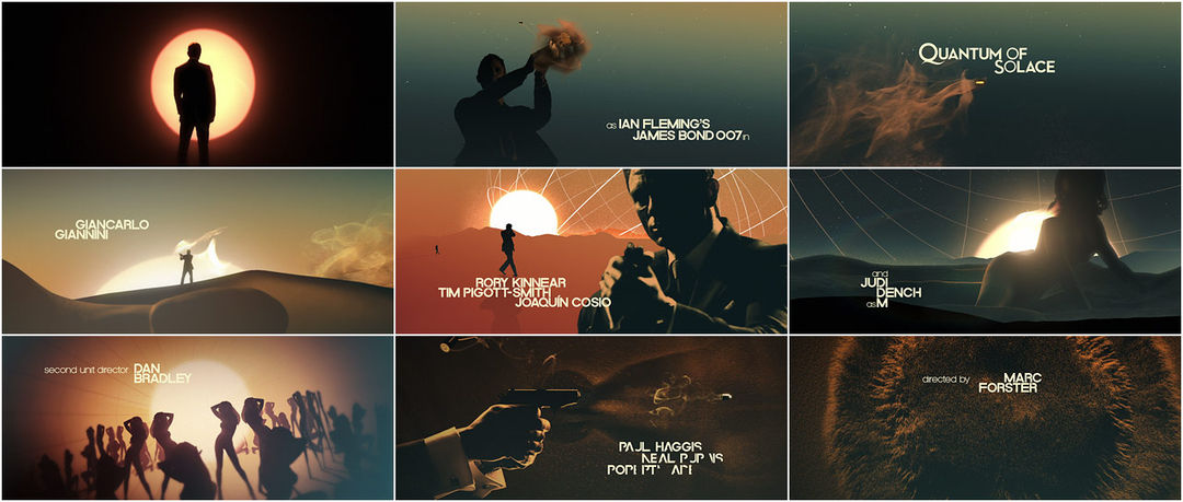
I was looking at many different sample title fonts from 'Artofthetitle.com' and came across a wide range of extremely interesting and engaging fonts that I wanted to share as they have certainly influenced us when thinking about our own title graphics. I particularly like two shots from the BBC crime/thriller 'By Any Means' below. The shot of the eye that has been colour saturized with a light blue tint, similar to the titles in 'Welcome to The punch' and the lighting from our bar location that I recceed not to long ago.
I also like the shot below with the words, 'By Any Means' written either side of the black line splitting the shot (horizon). The silhouette image of the man in front of the titles is also extremely powerful and causes the titles to stand out in comparison to the rather bland back setting. I also like the contrast in black and white as I feel it is similar to the effect we are going for (the idea of our protagonist having to deal with 'Two Evils').
I also came across the titles for 'Red Lights' in 2012 starring Robert De Niro. I am fond of the simple use of title/font in this collage as I feel that it captures the mood and tone of the film perfectly. This is something we would also want to recreate and so this has been of influence to us when thinking about our narrative graphics.
I am not a huge fan of the three red spot-lights by the title of the film in the image below as I feel it to strongly connotes love and is similar to the kind of font found in a Romantic Comedy. Having said this, the red neon colouring of the spot-lights is similar to the colour tone we want in our trailer and so we would perhaps look to use similar colours at certain points in our own trailer.
Despite the clear connotations of blood and horror from the titles below, the style and font is still of influence to us. When comparing a few of our sample fonts, they are similar to the font seen in the top left picture of the collage. We have definitely been influenced by the style of the font used in the collage below and would look to use something similar when producing the final title for our trailer.
Below are just a few more influences that we have considered when preparing are titles and even narrative graphics as a whole:
Our company is called, 'Encrypted Productions' and I have been searching for some influences as to how the font of our company name would look. I was particularly drawn to the photo below in terms of the font used. I like the dishevelled look of the word, 'troublemaker' as I think it creates an interesting effect but is also quite similar to the style of font we are looking for (bold, stands out from the background). Despite the fact that I do not like the cartoon head above the title, I am still drawn to the text below and would like to incorporate it into our graphics in some way.
As part of my research into titles and title graphics, I decided to come up with a
design in order to ascertain the difficulty involved in different aspects of design, and
to get a better feel for the look of our trailer. The title used is only a working title, as
'Two Evils' gives the title a slightly more horror-style feel, which is not something we are looking for.
This first attempt I think can be said to be one of varying success, but it may well
influence our final design.
There was another attempt before this, however this was attempted using Illustrator
rather that Photoshop, and using the Rockwell Extra Bold font suggested by Joe in
his graphics research. My knowledge of Illustrator is limited, and I was attempting to
get some sort of smoke or cracking effect on the backdrop. The colour scheme is along
the correct lines but other than this, very few aspects of this titlecard are successful. This
altogether less successful initial design can be seen here, in the wrong aspect ratio, in the
name of showing the full process of my designing endeavours.
Following my attempts at still designs for the title card on Photoshop, I moved to Motion to see if
I could use my ideas from influences, planning, and previous attempts, to create a moving title
card that would look more effective following a sound boom and dramatic montage. I came up
with three designs here, and I will ask the group which they think is the most effective.
This first design is monochrome, which I do not think plays into our genre or tone. The smoke effect of white on black does have a certain boldness but I personally would not choose this design as the final title card.
This design is coloured, and fits better with the colours and tone we intend our trailer to have, but I don't think the smoke effect is as effective as the first design, potentially due to the white text on the brightly coloured backdrop.
I believe that this third design is my strongest. It takes the best points from the still Photoshop design and adapts them to a moving Motion image. The colouring is bold and the smoke effect gives the feel I think I have been meaning to achieve throughout the design process.
CM