Final Trailer:
Monday, 27 April 2015
Sunday, 15 March 2015

Thursday, 12 March 2015

Friday, 6 March 2015
Evaluation 4

Development from AS to A2:
Blogger - My use of blogger has improved greatly from AS to A2, especially in terms of my confidence using and presenting the information on the software. I was not aware of the creative tool before, which allowed me to change the format and template of my blog in order to make the overall presentation of all of our information more clear. My use of the blogger also increased, in terms of embedding and linking videos, thus making my blog more interactive for the people viewing it.
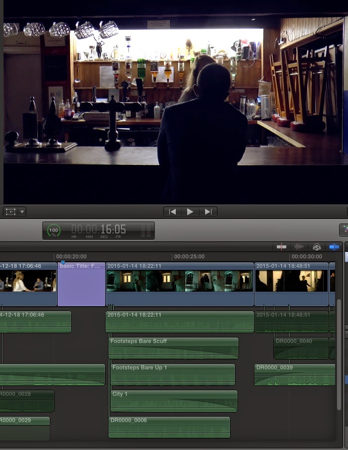
Hardware - Development has been seen in the use of our panasonic camera over the two years, especially in relation to our cinematography and positing/framing of shots. This was helped greately by the fact that we conducted a camera practise, shown in the research and planning stage of our media package presentation. We tested our limits in terms of camera positioning, especially through our use of low and high angle shots to suggest either dominance or inferiority at certain moments in our trailer. We were also more aware of trivial things, such as the camera's charge time, which allowed us to male full use of our filming time. Lighting was an area of media technology we developed drastically, mainly due to the fact that our style/colour and tone was essential to our trailer (Our main USP). Our biggest influences, such as 'Drive', 'Only God Forgives' and 'Welcome To The Punch' all experimented with different uses of lighting and tone, which is something we also wanted to do to suggest narrative, as well as create engaging and visceral images for our audience to remember. Our use of lighting was much more minimalist at AS level and so the development is extremely noticeable. Sound was another area, where we certainly developed despite still experiencing problems. Our audiences commented on our good use of 'dubbing' at specific moments, which suggests our development as this was not the case previously. We extended our use of sound by recording our own foley sound at particular moments, for example the 'gun cocking' and the footsteps leading up to the house.
Social Media - We didn't use social media at AS level, which we realised was a mistake as it allowed us to extend our product out to a wider audience, shown by the fact that many people we knew mentioned what they liked about the trailer, in which they saw on Facebook. We also used Instagram and Twitter to connect our audiences to the trailer online, which was again useful as it allowed us to show our film to a wider audience, instead of simply people we know already. Social Media has been invaluable to us as aforementioned, it provides that link between us and our audience on a post/comment platform.
Software - Our use of softwares, such as Final Cut and Photoshop has also improved dramatically over the journey of our two year course, especially in relation to the technical aspects used, such as our choice to colour match particular shots, for example the bar shots in relation to the scenes in the friends house, which were originally quite dull but after matching with the dark blue colouring in the bar scene turned out to be quite effective. This was essential due to the fact that these scenes were essential to the narrative of our piece. My personal use of photoshop developed tremendously over the two years. I wasn't aware of how to use photoshop originally but quickly learnt for the purpose of creating our own ancillary tasks as well as the advert and art of title compilations for the evaluation questions.
VIDEO OF THE DIGITAL TECHNOLOGY WE USED:
A video made on iMovie, highlighting how I made my magazine front cover using the photoshop software:
MT
Sunday, 1 March 2015
Evaluation 3
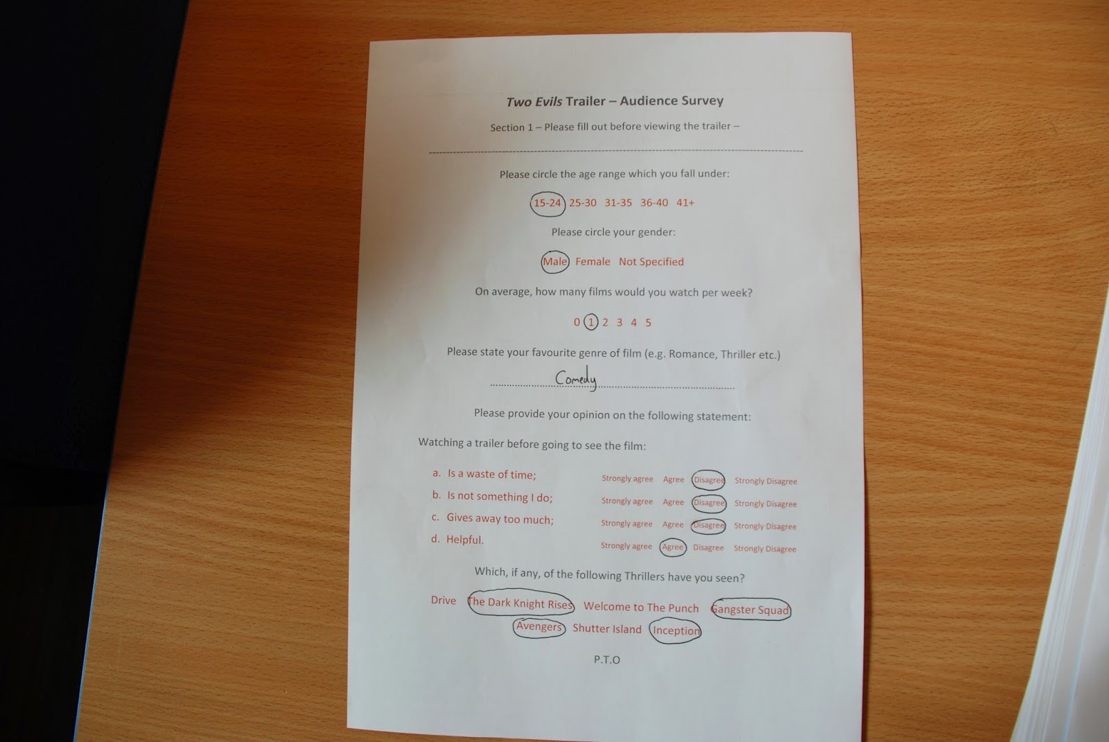
Audience screening - photos of people involved in our audience screening, answering the questionnaire:


Audience Survey below - we have taken a couple pictures of our questionnaire (back and front) showing the one side, which brought us quantitative data and the other side, which brought us qualitative data. This survey/questionnaire allowed us to collectively understand our target audience in more detail due to the fact that the results were as we expected. It suggested strongly that our target age range was between the 15-24 mark. It also informed us that the audience were particularly fond of many of the tropes of most crime/thriller trailers, such as the city shots and chase scenes, which suggests that we have conformed well to the conventions of most crime/thriller trailers. However, a bonus for us was that the majority of our audience commented on the fact that they liked the specific colour/tone/aesthetic of our trailer, which was something we worked hard on to make our trailer original and different from the others that have been released. Due to people's comments on the style, tone and other important tropes of the genre, we were confident that we had created a strong narrative driven crime/thriller trailer that conformed to the conventions of most, whilst adding our own but effective twist.

Audience Survey - audience replies to the question, 'What was your favourite part of the trailer and why?'
1. 'Shots of London and strong, clear narrative'.
2. 'High shots of Gabriel running and sliding down banister; the shorter snapshots of film with music near the end'. (montage)
3. 'The interrogation scene, high intensity'.
4. 'Tense Music, cuts from action to romance'.
5. 'News shot'.
6. 'Gabriel running through London, news flash, vibrant colours'.
7. 'Montage sequence, news flash, city shots'.
8. 'Shots of buildings with clear narrative'.
9. 'shots of the city & colouring of overall trailer - nice clear aesthetic'.
10. 'Good use of colour'.
11. 'Use of London settings e.g London eye and the use of blue colour as it established tone'.
Questionnaire Results:
 | ||
Due to 100% of the audience saying that they would go on to watch the film after viewing the trailer (Most of which were within our target age range), and a majority viewing of films such as "The Dark Knight Rises" and "Drive" we can conclude that we have chosen the correct colour and tone for the film; one which appeals to the audience which we are attempting to target.
Vox Pops for magazines, poster & trailerAudience Research for Magazine Front Cover: |

I decided to show our trailer to two people who we have worked with previously for our AS piece and discuss with them what they thought about the trailer as a whole. My main aim was to find out if the narrative was clear to the audience because that is essential to a trailer. I also wanted to know more about what they liked and disliked to add to our already substantial audience research. This was to get a wider understanding of our target audience and to find out what worked and didn't work in our trailer.
Audience Research - Social Media:
We decided to upload our trailer to Facebook, in order to gain more information about our target audience and also generate interest around our product. Due to the fact that we were learning about postmodernism, especially in relation to Web 2.0, we realised the importance of social media and how it is shaping our modern media world. Most producers nowadays use social media to promote their media package as it is extremely important in developing and creating a particular niche audience or even for reaching out to your originally targeted audience. I personally have over 800 friends on Facebook, which is a much larger and mixed audience of people from all different age ranges, which again allows for our film to reach a wider audience.


https://www.facebook.com/max.twyman.7 (link to trailer on Facebook page)
Instagram was also useful for uploading a short 15 second snapshot of our trailer, which would again generate excitement around our film and open up a wider audience. It helped us to again find out more about our target audience.
MT
Friday, 27 February 2015
Evaluation 2
This is our directors commentary/split screen video, aimed to assess the question, 'How effective is the combination of your main products and ancillary tasks'? This video covers all of the major topics related to the question, such as the different lighting we used and our general aesthetic. We linked pictures of our real media influences as well as our own products in order to show what we were talking about in time with what we were saying:
MT
Tuesday, 24 February 2015
Evaluation 1
In what ways does your media product use, develop or challenge forms and conventions of real media products?
Major Influences By Name:
'Welcome To The Punch' - Overall style
'Hummingbird' - Overall style
'Departed' - Location
'Irreversible' - Colour and Tone
'Only God Forgives' - Colour and tone
'Zodiac' - Titles and Sound
'Eastern Promises' - Character ambiguity
'Gangster Squad' - trailer narrative
'Taken' - trailer narrative
Location:
We took particular inspiration from many of our main trailer influences, such as 'Welcome To The Punch' and 'Hummingbird' for our different locations. We wanted to contrast the bright, London (city) location shots, as seen in 'Welcome To The Punch' with more darker, gritty style locations as seen in the 'Departed' trailer and in our own trailer, when we show our main protagonist in the alleyway. This way we could both adhere to the common conventions of many crime/thriller trailers, whereby establishing city shots are used to over-emphasise the power and influence of the crime world and also challenge normal conventions by developing our main protagonist's character and one of the best ways for us to do this, was through using different locations that could represent opposing sides of his character. We particularly wanted to use this contrast in shots in order to highlight the different worlds of crime in our trailer; one of glamour and money and the other of death and betrayal (Boss and friend of main protagonist tries to arrest him).
We used many outside locations, such as the Southbank, China Town and the Car Park, which can be seen in most crime/thriller trailers as it is a fairly action-packed genre in the first place and we wanted to adhere to this by filming much of montage Act in multiple city locations in order to highlight the frenetic, uncontrollable world of crime that most crime/thriller trailers depict. Most crime/thriller trailers employ the use of establishing shots in order to reveal the city, whereby the action is taking place and also to reveal the main characters of the story. We conform to this part of the genre by establishing London as the city, in which our trailer is set, through multiple panning shots of different London motifs, such as the London Eye and the Millennium bridge. We also employ establishing shots of the main actors in our trailer, especially our main protagonist and the female actress in the bar scene. We also establish the main antagonist in our story through a voice over and panning shot of him leaving a car park after an evident job has been 'completed'.
We also wanted to contrast the outside shots with effective interior shots, especially seen in our Bar sequence with 'Aaron Mays' and our female character, which informs the audience a lot about the story we are trying tell and even suggest a possible relationship between the two, which conforms to many crime/thriller trailers, which also employ a 'love interest' character.

Graphics:
Our graphics were inspired mostly by those of our main influence, 'Welcome To The Punch', with the still title, coupled with a moving image in the background of the letters on the screen. It is important for the graphics in most crime/thriller trailers to stand out in comparison to the highly glamorous shots of multiple city locations shown before & after them. Even those trailers that employ more gritty/subdued locations, most often deploy engaging (stand-out) titles that are memorable for an audience. We wanted to create this 'high-budget' feel in our narrative graphics in order to adhere to not only our main influence as aforementioned but also the conventions of most graphics in crime/thriller trailers, which employ stand-out and eye catching graphics that an audience remember and also associate/draw a link with our poster cover title. We wanted to suggest the glamorous, high-budget world of crime through our narrative graphics and we did this by adding effects, such as glows in order to make the titles stand out against the block background.

STUDIO IDENT - We wanted to create a professional (high-budget) styled Ident, similar to the ones seen on the trailers that we were influenced by. This way we would be adhering to the conventions but at the same time creating an Ident that would fit with the tense, action-packed style of our trailer. I attempted to make one on motion prior to this that didn't turn out exactly how I expected so scrapped the idea and we begun work on another one, which can be seen below and we felt suited the style of our trailer more closely.
Sound:
Most of the trailers we watched when looking at sound deployed a large use of different styles of sound, such as a recurring soundtrack that kept the flow/rhythm of the trailer running smoothly, mixed with lots of foley/ambient sounds, such as sound booms, gun shots and voiceovers. We adhere to genre by using all of these sound techniques, such as ambient, separately recorded footsteps for certain moments, which create tension amongst the audience, a voiceover between Act 1 & 2 to not only link the acts seemlessly but also for the purposes of informing the audience on important aspects of our story and multiple sound booms, usually before an establishing shot or a credit. We didn't work with our main soundtrack until the latter stages of the editing process due to the fact that we wanted to finish a rough cut before handing it to our musical producer, but we realised the importance of the soundtrack, especially after revisiting many of our main trailer influences to recapture our original ideas on sound. We challenged the conventions slightly by employing one underlying soundtrack that runs all the way through our trailer unlike many conventional crime/thriller trailers that dip in and out of the main soundtrack but we still used conventional ideas, such as lowering the soundtrack and increasing the ambient sound at moments of important dialogue, especially noticeable in the scenes with our main protagonists and his 'friend', which is another example of us adhering to the original conventions of the genre.

Title:
The title is fairly similar to the narrative graphics shown throughout the trailer, but is slightly different, which we felt was important as it continued to conform to the conventions of the trailer but added something extra, which the audience could then remember as it is the final thing they see on screen and so we wanted to place extra importance on it, in order to impress our audience and leave an image that would last in their memory. We undoubtedly developed this part compared to our final at AS, which was rushed due to the fact that we didn't view it as that important, which was clearly an error in judgment. At AS we took more time over the final title, which not only improved the quality of our trailer but also adhered to the conventions of most title presentations in film trailers, especially those, which we had studied ('Welcome To The Punch').

Colour & Tone:
We placed particular importance on colour and tone in our trailer as we wanted to find an aesthetic, similar to that in 'Welcome To The Punch', which could be a recurring motif throughout our trailer and something, which our audiences to identify and think about throughout the trailer itself. We used multiple filters, during Reccee's and found that we were extremely fond of the dark blue, especially seen in Act 2, with the bar scene & the scene's in the friends house. We wanted to use the bright neon style colours as seen on buildings located all around the Southbank area of London, which adheres to the style, in terms of colour and tone, seen in 'Welcome To The Punch' and 'Hummingbird', with the bright lights of Soho. We were also influenced by the colour and tone of the 'Irreversible' trailer, starring Vincent Cassell an actor found in many of our crime/thriller trailer influences, which also uses bright colours, such as different shades of oranges and blues. We challenged the conventions of many crime/thriller trailers with our use of brighter, more neon style colours as most employ a darker set of colours that represent the darker world of crime, especially seen in 'gangster squad', 'departed' and 'eastern promises'. We are still adhering to the conventions seen in a major trailer however ('Welcome To The Punch'), which justifies our actions for going against the conventions of the majority of crime/thriller trailers. 'Only God Forgives' starring Ryan Gosling also employs the use of Neon style colours as a recurring motif throughout, which we felt would be suitable to apply to the style of our trailer. Lighting tropes were essential to our trailer, especially due to the fact that we were not blessed with an extremely high-budget, meaning that we had to think very carefully about style, positioning of camera and light positioning and colouring in order to create the stylised shots we wanted without using a high-focused camera and state-of the art equipment seen to be used in our major influences. Utilising these tropes of the crime/thriller genre was essential as the narrative connotations, such as romance, revenge and innocence, which can be found in almost all crime/thriller films, such as Fight Club, The Dark Knight Rises as well as in our trailer are clear to see through the focused positioning of both our lighting and camera.

(Our Trailer)

(Only God Forgives Trailer)
Cinematography:
We use and develop conventions of most crime/thriller trailers to a certain extent, especially when linked to the specific framing/width/positioning of the shots in our own trailer. The 'Zodiac' trailer for example takes particular care over the framing of the shots in order to suggest the narrative, whilst almost 'wowing' the audience with their choice in shots and keeping them engaged in the story they are telling. We have certainly developed in our vision and skills in cinematography as we wanted to use the ideas seen in our trailer influences and then develop them to fit with the style of our trailer. This can be seen below with the powerful shot of Jake Gyllenhaals character standing outside the press building at a low angle, suggesting a lot about his character/s role in the movie contrasted with our shot, whereby we developed this idea but shot it at night time and against a neon lit (fitting with our colour and tone ideas) wall. This shot suited the style of our trailer as it suggested danger evolved around our main protagonist but at the same time creates a powerful image that the audience members can remember at the end of our trailer. We also decided to frame our main protagonist in the middle of the shot in order to highlight his importance, despite the overwhelming task facing him, suggested through the sound and pace of this montage scene.

(Zodiac Trailer)

(Our Trailer)

(Zodiac Trailer)
Character/Actor:
We adhered to the conventions of most crime/thriller trailers, through our use of characters and how we allow them to appear throughout the duration of the trailer. Most crime/thriller trailers place particular importance on a character (usually the main antagonist) whilst keeping him fairly ambiguous. This can be seen in 'Gangster Squad', one of our influences, whereby Sean Penn's characters is presented as central to the story but is also kept fairly ambiguous throughout, leaving the audience wanting to know more. We attempt to do something similar in our trailer, especially during Act 2 when our main antagonist is walking towards his car and their is a voiceover explaining who he is, keeping a large sense of ambiguity around his character. We also further this with a few shots in the montage of our main antagonist on the phone in an alleyway. We challenged the conventions of many crime/thriller trailers however, by producing a more character based sequence, instead of focusing solely on 'guns' and 'action', like most of the trailers we viewed. We wanted to reveal more about our main protagonists inner feelings and emotions in our trailer and so we decided to include shots, such as the intimate moment in the bar sequence, which could help the audience to relate to him more and thus allow them to actively become involved in the trailer, instead of passively enjoying it.

Narrative:
Most conventional crime/thriller trailers, such as 'Gangster Squad' and 'Eastern Promises' employ a narrative that has some complexities but is usually fairly easy to follow and decipher, which is what we, as a group wanted to produce. Something that the audience could passively enjoy but also provide twists that the audience could actively think about. Our twist is shown in Act 1, when our main protagonist discovers the man he has been chasing for years is dead and realises that he has opened up a whole new world of crime. Our narrative in terms of its complexity and thought has certainly developed from our AS product, which used a fairly simple storyline that was easy to follow and passively enjoy. It has certainly developed this year as seen by the fact that we had to think about the whole film, instead of simply the opening two minutes.


Editing:
The editing was catered particularly towards producing a trailer that both adhered and challenged the conventions of most crime/thriller trailers and even the thriller genre. Much of what has been previously said, was produced during the editing stage, in order to create the effects we most wanted to produce. We took influence from the editing of the 'Welcome To The Punch' trailer, which mixed together both fast-paced and slower-paced editing in order to highlight the more intimate moments directly contrasted with the action. We did something similar with our fast-paced montage directly contrasted with the intimate moments in the friends house and during the bar sequence. In order to keep the blue colour motif throughout we decided to colour match many of the shots we had taken with our favourite shot that used the blue-neon filters (bar shot with protagonist and female).

Below is an Art of Title style compilation of shots from our trailer, linking to the paragraphs above as well as mirroring the second compilation of our influences.

Below is another Art Of Title style compilation made on Photoshop, highlighting shots from our two main influences, 'Welcome To The Punch' and 'Hummingbird'. The shots are similar to the ones seen above in the Art of Title compilation from our own trailer:

Magazine and Poster Prezi for the products I created:
Prezi on our finished/chosen poster:
MT
Thursday, 19 February 2015
Rough Cut Draft 2 - audience feedback
This is an edited version of our film without the main soundtrack:
Audience Feedback on Rough Cut Draft 2:
feedback from audience who viewed our second draft:
POSITIVE:
- nice colouring
- tight editing could be more controlled
- interrogation scene is good.
- slick montage sequence.
- looks similar to our animatic (picture seen below)
NEGATIVE:
- change graphics for news story moment (doesn't sound 'real' enough)
- sound dubbing needs to be improved with soundtrack
- cut down dialogue at specific moments (Act 2)

MT
Wednesday, 18 February 2015
Editing Revisions 4 (Audience feedback)
Voiceover:
We experienced difficulties when syncing our voiceover moments to the shots on screen, especially the moment with the 'news announcement'. This moment was particularly difficult as we wanted it to look and sound professional, especially because it is easy for a news style presentation, as seen in many films, to come across as quite 'amateurish' and so we spent a lot of time recording different voices until we found one that worked with the overall style of our trailer and the one, which sounded most professional. Another difficult moment was in Act 2 whereby we wanted to employ a voiceover of our main protagonist talking about our main antagonist, whilst being overlaid over a shot of the antagonist walking to his car. This was difficult as I had to cut particular moments of speech apart, adjust sound levels and then place each sound bite specifically over the long shot in order to keep with the timing and pace (overall rhythm) of the trailer. Some of the small speech was completely cut out in order to achieve this aim of keeping to the rhythm of the trailer.
Audience feedback from our audiences suggested that the voiceovers at particular moments were not clear enough, thus explaining why we spent more time editing them (especially the news moment, which was certainly not clear enough).
MT
Tuesday, 17 February 2015
Editing Revisions 3 (Audience Feedback)
Graphics:
We had difficulty in selecting our graphics in the first place due to the fact that we had multiple graphics to choose from. We decided upon the graphics that were similar in style to the ones seen in our major influence, 'Welcome To The Punch' as we felt they best suited the style of our trailer. Where to place the graphics was also a problem, as we had to deter slightly from our storyboard plans originally. This was because some of the shots we used were shots we had taken whilst filming that we hadn't originally planned for and grew particularly fond of and so decided to place them into our trailer. This way we had to change the placement of our graphics slightly. However, this did not effect the editing process that much.


Audience feedback - we changed the positioning of our final graphics to appear before one final shot, which was suggested to us as an effective technique to use in order to keep our audiences interested and engaged with the film. We also had to decide between three different similar styled title/graphics, which we made in Sony Vegas and this decision was strongly informed from our audiences who helped us to decide, which narrative graphics looked best.
We had difficulty in selecting our graphics in the first place due to the fact that we had multiple graphics to choose from. We decided upon the graphics that were similar in style to the ones seen in our major influence, 'Welcome To The Punch' as we felt they best suited the style of our trailer. Where to place the graphics was also a problem, as we had to deter slightly from our storyboard plans originally. This was because some of the shots we used were shots we had taken whilst filming that we hadn't originally planned for and grew particularly fond of and so decided to place them into our trailer. This way we had to change the placement of our graphics slightly. However, this did not effect the editing process that much.
Audience feedback - we changed the positioning of our final graphics to appear before one final shot, which was suggested to us as an effective technique to use in order to keep our audiences interested and engaged with the film. We also had to decide between three different similar styled title/graphics, which we made in Sony Vegas and this decision was strongly informed from our audiences who helped us to decide, which narrative graphics looked best.
MT
Sunday, 15 February 2015
Editing Revisions 2 (Audience feedback)
Lighting/Colour Matching:


After placing our shots onto the timeline we quickly realised that some of the shots did not particularly match with the style and tone of our trailer, especially in terms of colour and so I decided to colour match the shots that did not work with the shots we felt did, for example the scene in the friends house, matched with the intimate blue colouring of the bar sequence.
(see shots below for link between colour of bar sequence and friends house)
I decided to play around with the different colourings in each shot in the first place in order to give us the slick, 'welcome to the Punch' style we wanted from the beginning of the process. Below you can see how I colour matched the first shot with the second one in order to give it the slicker, more stylised image we wanted.
The final shot of act 2, sees the car leaving the car park, just after seeing the main antagonist stepping into it. I decided to colour match with the first shot in act 2 and then fiddle around with the colour board in order to create the desired effect.
Below are just a few more example of me playing around with the different colouring in some of the shots in act 2.
We also had to re-shoot the interrogation scene because the lighting again, did not fit with the overall style of our trailer. In truth, the original colouring was too 'boring' and was not as effective as the re-shoot, which made use of much darker, moodier style lighting that we felt represented the moment as well as the characters situation better at that present time in the narrative.
Audience feedback - our audience feedback on style/tone was particularly complementary and this was because it was something we felt was necessary to the success of our film overall. We decided to make each shot fit next to each other by using the colour/matching tool as aforementioned.
MT
Saturday, 14 February 2015
Editing Diary Entry 1 (Audience Feedback)
Sound Issue:
Whilst editing the second Act, I had particular difficulty in cutting together the sound of the dialogue with the actual shots on screen. I pertinent example of where I had trouble with this was the bar scene as I found it extremely hard to sync the directional sound with the characters speaking on camera. We had to re-record the sound for this sequence so it was particularly difficult to synch correctly.


Another issue presented to us was that of the soundtrack. We were using a temporary soundtrack due to the fact that our music producer was going to edit the sound to our finished trailer and so it made it particularly difficult to edit together the trailer considering we were not entirely sure how our music would turn out. This way we had to edit the trailer to the temporary music and then adjust once we had the final piece if necessary.
Audience Feedback - sound was something we had particular trouble with as aforementioned and were given feedback, especially from our audience who suggested certain things that helped us improve the overall quality of our trailer. This included dubbing the foley sound over the top of our soundtrack so they both worked well in conjunction with each other (especially section in photo above, with footsteps leading up to house).
Whilst editing the second Act, I had particular difficulty in cutting together the sound of the dialogue with the actual shots on screen. I pertinent example of where I had trouble with this was the bar scene as I found it extremely hard to sync the directional sound with the characters speaking on camera. We had to re-record the sound for this sequence so it was particularly difficult to synch correctly.
Another issue presented to us was that of the soundtrack. We were using a temporary soundtrack due to the fact that our music producer was going to edit the sound to our finished trailer and so it made it particularly difficult to edit together the trailer considering we were not entirely sure how our music would turn out. This way we had to edit the trailer to the temporary music and then adjust once we had the final piece if necessary.
Audience Feedback - sound was something we had particular trouble with as aforementioned and were given feedback, especially from our audience who suggested certain things that helped us improve the overall quality of our trailer. This included dubbing the foley sound over the top of our soundtrack so they both worked well in conjunction with each other (especially section in photo above, with footsteps leading up to house).
MT
Thursday, 12 February 2015

Wednesday, 11 February 2015
Poster - Main Image
We decided to use a shot from our trailer as the main image for the poster front cover. We all used the same image as we all wanted to create a similar effect, with the gun pointing out towards the audience in order to make them complicit with the film itself. This would also provide a link between both our poster and our trailer, which the audience could use as a connector between our media package. The image of our main protagonist holding the gun also fits with the style of our trailer/film and adheres to the genre of the most crime/thriller trailers/posters, such as 'Welcome to The Punch', which employs the use of their main character (James Macavoy) as well as other characters, holding a gun.

Below is an example of me layering the image of Gabriel into the already existing lines:


MT
Tuesday, 10 February 2015
Poster - Difficulties
I had particular difficulty in colour balancing/saturation of the central image of Gabriel so that he wouldn't stand out as much in comparison to the background image from one the shots from our trailer.

MT
Saturday, 7 February 2015
Poster - progress
I decided to change the positioning of my title for the front cover of my poster as I wasn't completely fond of it at the top in between the city filled lines. I much prefer the new positioning but was not engaged by the colouring of the title on top of the blue gradient background. Due to this, I decided to add an image from our trailer (moment between Gabriel's character and our female character), which is one of my favourite shots from the trailer into the background of the writing. I much prefer this compared the block orange title I was using before, because it is more engaging and relevant as to our trailer, creating that link in our production package.

I also decided to change the arrangement of our main actors names in order to again make the poster more exciting and engaging for the audience. I again, much prefer the new positioning as I think they work nicely just below the city filled lines above.

I decided to place a tagline from our trailer at the top of the poster where the film title was originally placed. The tagline was lifted straight from our trailer where it can be seen in the montage with the font/colouring changed in order to the fit the style of my poster. This also links the two products together well creating verisimilitude which is necessary for a movie trailer/poster release.

I've also begun to add the necessities in different places around the poster in order for it to be more visually engaging and also to adhere to the criteria needed for a movie poster.

This is how it is looking thus far. Overall I am pleased with how it is turning out.
MT
Subscribe to:
Posts (Atom)