Thursday 11 December 2014

Filming Schedule

This is the schedule for our filming dates coming up due to the fact that we want to complete all of our filming over the christmas/winter break in order to leave ourselves with enough time to complete the editing as well as get underway with our ancillary tasks (poster & magazine cover). We felt it was necessary to plan our time ahead in order to keep on top of things over the holidays, whereby daily contact is not as easy.

Filming Schedule:


  • Lizzie Grice replaced as female character by Georgie Ward.
  • Alfie Mann replaced as Secondary Antagonist by Joe Rose.

MT

Wednesday 10 December 2014

Institutional Analysis of Sight & Sound


CM

Institutional Analysis of Little White Lies


The publisher of the magazine Little White Lies is TCOLondon. This is a company which specialises in slightly off the wall, individual and quirky takes on stories which would not usually get views, or angles on films which are not usually assessed. The very branding of the website (www.TCOLondon.com) as shown below differentiates itself from other forms of media by defining itself as a breed, something which is lifelike and ever evolving. From work in skateboarding, phone companies, games consoles, and sponsoring YouTubers, their list of partners ranges from Grolsch to Audi. This shows where the inspiration for Little White Lies comes from, as well as why the company decided to back such an out-there product. Even within their distribution, with Little White Lies originality being an online-only magazine, they establish themselves against the norm and through this use of technology cater to a specific audience.


This audience is that of 18-30 year olds who are either young professionals in or students of media. They must have significant disposable income because of the monthly subscription of £3.95 for a product which, looking past its potential as a collectable and art, provides less than a week of entertainment. This suggests than that like Empire and Sight&Sound, that the demographic for the company is ABC1 and massively involved with South East London promotions. This is done in the Barbican, BFI and Picturehouse cinemas' and film festivals which caters to the sort of indie film buff audience with disposable income. The benefits of this are found within independent and cult cinema fans who would rather discuss films as an art form rather than just passive entertainment. The magazine caters to independent critics and in depth interviews with cast, directors and producers in order to help their readers form opinions upon the films they cover. 


The magazine, along with others' of its type, use mosaic geodemographics in order to establish the type of person their product is going to cater towards. An audience segmentation can be found below. This shows that the majority of the audience is found within London based Hipsters which falls under the magazines demographic of Group O buyers, standing for Urban Intelligence that 'Mostly consists of young and well educated people who are open to new ideas and influences'. It also caters to audiences such as Group E, young people who have gone through higher education and can be liberal of idea, and have access to disposable income. It caters to this audience through claiming to be about truth which connotes authenticity. Because of this, the more niche audiences of Arthouse film fans and Aspiring filmmakers are also catered towards, while more mainstream film fans and design students are left to read magazines like Empire and Total Film.


The purpose of the magazine fits with the publisher's slightly independent style of reporting. Even from the weight of the paper the magazine feels like a substantial product, filling a gap in the market for collectors items concerning film, which is then corroborated through the hand drawn/graphically modified artistic style of the covers (Of which they employ independent designers) and the typography of the front cover. The choice of film is also essential as to its purpose, and in turn the sorts of audience which are going to read it. Taking up yet another niche gap in the market, focusing on films such as "Black Swan" and "Let The Right One In", they decipher films which are not only in between the mainstream and indie genre but also those which are going to obtain a cult following. Due to this, in combination with the subtle yet aesthetically pleasing cover which screams that the magazine producers know their movies, the magazines' purpose is to fill a gap in the market between Empire's mainstream coverage and Sight & Sound's more individual movie coverage through an artistic and bold cover, substantial page thickness and quality which would leave you wanting to show your collection off to your friends. 


JL

Tuesday 9 December 2014

Institutional Analysis - Empire Magazine


Purpose:
  • Steven Spielberg - 'Empire is the best movie magazine in the world bar none. Quite simply, it's peerless'. 
  • The previous quote pretty much sums up 'Empire' and it's purpose as a magazine. It is quite simply the most popular movie magazine on the market and thus it has to constantly release the highest quality magazines in order for it to keep this title. 
  • It can offer audiences many different exclusives that other magazines cannot offer because of it's popular/well-known title. This in itself gives the magazine a purpose of constantly wanting to find new exclusives (interviews etc with stars) in order to keep and expand their already large audience. Without these exclusives, 'Empire's' audience would most probably look elsewhere.   
  • according to Bauer, Empire's purpose is to provide, 'indispensable insight into cinema, both blockbusting and classic'. 
  • It is evident that Empire, in stark contrast to magazines, such as 'little white lies' and 'sight and sound', provide far more mainstream coverage of the bigger and more high-budget movies being released. Having said this, they do still cover the more independent movies, which could again suggest something about their purpose as a magazine. They would like to hit all audiences (basically film fans in general, instead of particular 'niche' audiences that might buy the more independent magazines), in order to increase the consumption of their product. 
  • Perhaps the purpose of empire magazine is emphasised through their particular style of reporting - They attempt to reach out to all different audiences (mainly male of all ages) and this can be seen throughout the magazine, with pages devoted to hundreds of different movies of all different genres and styles. This idea of the magazine being mainstream as previously mentioned gives it a purpose, which, as Bauer explained is to give audiences an insight into cinema (of all different genres) that cannot be seen elsewhere from any other magazine on the market. This is why people buy empire magazine.
MT

Sight & Sound "Cosmopolis" Magazine Cover Reasearch


CM

Little White Lies "Attack the Block" Magazine Cover Analysis


JL

Monday 8 December 2014

Magazine Cover - 'Empire'

This is a piece of analysis on one of 'Empire Magazines' front covers completed using the Photoshop software on the Mac:


MT

Friday 5 December 2014

Film Poster Research - The Godfather


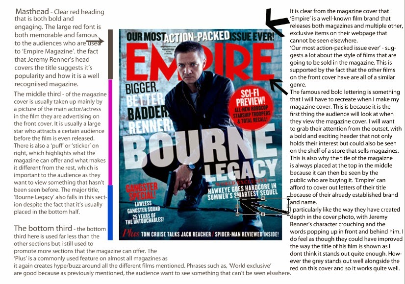
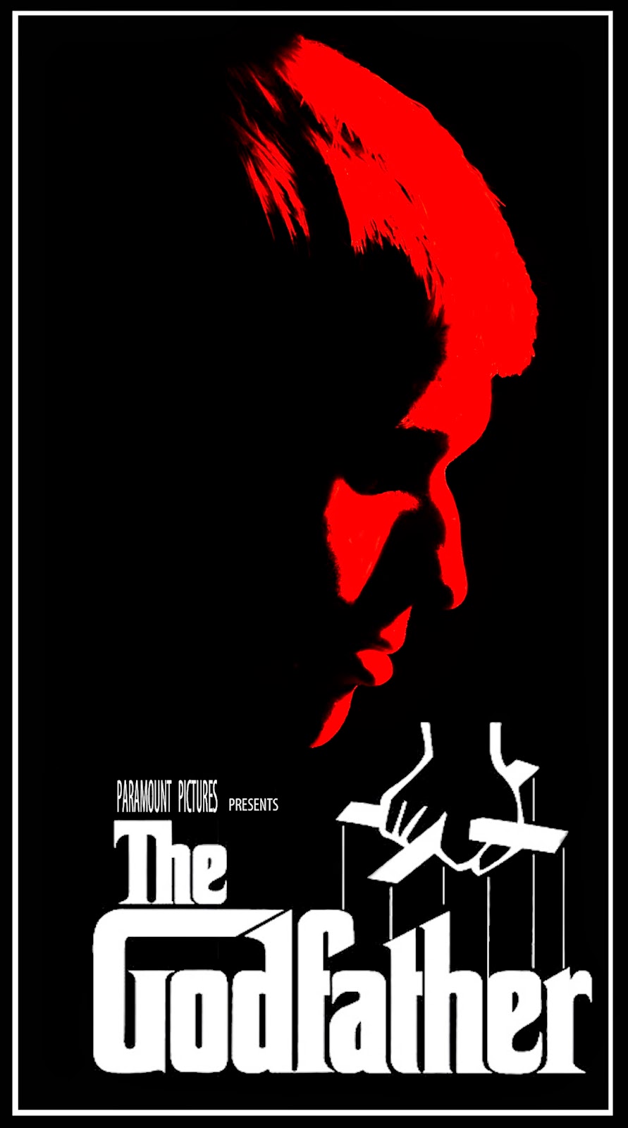
The colour scheme of The Godfather poster is typical of films of
the genre. The use of null colours, with no texture nor shade in
combination with the contrasting reds, whites and blacks suggests
 conflict between two clear cut sides of a strife with the blood red
shade of the mans face emphasising this. There are also suggestions
 of old vs new, again highlighted by the contrasting colour scheme of
the poster. The elder is seen as more powerful, due to the use of
puppet strings over the title of the film. Puppet strings are often shown
 as signs of manipulation and power, both themes central in the film.
There are alternate posters for the film "The Godfather", one of which
 showing a shaded character with a rose in his pocket. Of a similar
 colour scheme and nature of this poster, we can also reference
 the connotations of the rose in film. Showing passion and an
ability to love, but it is also commonly viewed that roses have a
more negative connotation, seen from their thorns. Again representative
 of the film, something beautiful and powerful can also have a dark
side and being the only object of the colour, this darker side is
emphasised. Finally, the lack of clarity and definition of the
poster reflects the film itself, with hierarchy's of power constantly
 being challenged.

The anchorage of this poster of "The Godfather" is of major importance
for a first time viewer of the film. Without it, one would imagine a comic
 book, possibly of Marvel's darker section with the black and red dominating the poster.
With the text however one realises that the poster actually represents a film, shown through "Paramount Pictures
Presents" which not only shows the poster as advertising a film but also attempts to entice fans of the
production company Paramount to see the film. There are also connotations in the text of the poster,
with "The" godfather suggesting an unparalleled power, and a godfather which everyone knows about. The word "Godfather" itself has previous Mafia links and is reflected in the film, however it also suggests a link between the viewer and the
Godfather, enticing the reader further. Finally, the font of the poster title seems expressionistic yet
clean, again reflecting the contents of the film.

The tone of the poster, and in turn film, is a dark one. With the dominating colour being black there is a
 negative and sinister tone suggested through the colour scheme. There are also suggestions of conflict
 and blood through the blood red colour of the dominant figure in centre shot. There are also levels of
formality which are implied through the poster, as previously mentioned the use of "The" instead of "A"
or an alternate phrase suggests a familiarity and power which is unrivalled. Through the facial expression
 and positioning of the man in centre shot, we can also see that the poster takes a dejected, solemn tone
 which again is reflected in the colour scheme.

There are no intertextual references as such, however the "Paramount Pictures Presents" takes part of
 the viewers focus away from the poster and to the production company. This becomes more and more
important in the two sequels of The Godfather as it links them to the previous films through title and production
 company.

The target audience of the poster is relatively obvious. The dark, sinister use of black and red with the film
being an 18 itself closes the target audience off from the bottom end of the most typical film market (15-24) and
 opens the film up to more adults, suggesting a maturity about the film and connoting themes which only the
elder generations can understand. It is also directed at a primarily male audience, with the person in the position
 of power in both the title and poster being a man. It also sells itself to a fan of good film, with a minimal
poster suggesting the majority of the marketing to be done in hype around the film itself.

There are no obvious ideologies in the poster, simply due to the lack of character definition in the poster and the null
colours. Through knowing the film, one can suggest that through the lack of vibrancy and emotion in the poster the
gang/mob life is looked down upon as not always coming out on top, which is slightly emphasised through the facial
 expression of the man on the poster.

JL

Film Poster Research - Raiders of the Lost Ark


The iconic whip, as well as a sword and gun, suggest that this is a film involving a lot of action and adventure, with 
the imagery of the Ark and temple bring in the idea of antiquities, archaeology and ancient civilisations. This is also 
suggested by the golden colouring of the poster (emanating from either Harrison Ford or the Ark), which suggests 
value to the artefacts and lends even more of the adventuring atmosphere. The numerous faces and their expressions 
connote various things about their characters, such as the 'damsel in distress' figure of the dark haired woman, or the 
shadowy ominous figure of the bespectacled nazi. These faces, the weaponry, the stance of Ford, the snake, the 
burning at the stake image, and the imagery of archaeology, all paint 'Raiders of the Lost Ark' as a proper, adventurous, 
thrilling outing.

'The Return of the Great Adventure' is an interesting strapline as it both suggests a harkening back to an older style

 of cinema, where adventurers and goodies vs baddies was more common, but also a new spin on the style, which 
could appeal to both older and younger audience. The title is reminiscent of an old comic book title or of a 
Douglas Fairbanks Jr film, as well as being exciting and intriguing, which links back to the idea of a 'revisiting' 
of the adventure genre.

Harrison Ford, with his buttoned down shirt, active stance, raised weapon, and Eastwood-esque headgear, is the 

classic adventure hero, fending off the heinous nazis with one hand back to protect both the story's heroine, and 
the Ark. The tone of the poster is thrilling and action packed with a lot to take in, whilst still retaining an emphasis 
on the characters and features of the film itself. The nazis are all straight-faced and solemn, a sense of formality 
surrounding them and contrasting with the not-altogether-groomed look that Ford is sporting, clearly painting him 
as the anarchic and free thinking hero to battle the authoritarian nazi antagonists. The tone of the poster is compliant
 as such, with a playful and fun spirit behind it that is combined with the thrilling and active imagery of adventure.

There is reference to the older genre of adventure films in the poster, and many of its hallmarks are drawn on.

 Obviously nazi and obviously middle eastern figures appear, a feature of the more conservative nature of 
earlier Hollywood cinema, and the poster's style of art and arrangement is distinctly evocative of film posters of that era. 

The film is obviously directed at a younger male audience, with the poster featuring stereotypical 'hero' and

 'damsel' figures, and presenting a sense of morality that is simpler and more 'black and white'. The attractive
 female and aspirational male are obviously directed at a certain gender. In terms of age, the genre would 
traditionally appeal to younger consumers, although there is an attempt to be more 'catch all' in the revisiting 
of an older genre and the angle that that is directed in. 

In terms of representation, all but one of the figures appearing on the poster are men, all but two are white, and

 all but three are white men. The woman is in a submissive, frightened pose that depicts her as the 'damsel' figure
 who needs protecting by the manly Ford. The two middle eastern men on the poster are not central to the plot 
particularly and can thus be viewed as having been put in the poster as 'curiosities' to make the film seem more
 exotic or adventurous. This, paired with the depiction of the evil nazi German antagonists could give an air of 
xenophobia to the poster.

The poster is very effective at conveying genre and character through colours, figures, and imagery. It draws in 

a wide audience with promises of excitement and adventure whilst remaining a sophisticated and eye catching 
piece of advertising.

CM

Road to Perdition - Movie Poster Research

Connotation - The visual image of the father and son wearing similar clothes and holding hands connotes this idea of a family bond, which is central to the main theme of the film itself. Tom Hanks holding the Gun and the shadow covering half of his face suggest something different and create mystery around the poster. This links into the Film Noir style that the poster is clearly trying to connote. The rain splattering across the poster also creates a powerful image. You can almost hear the rain, which connotes the idea of the family bond as aforementioned being broken, which is a major part of the film, due to the fact that the son witnesses what his father (Tom Hanks) does for a living. The film noir style of this poster is certainly shown through all the visual images presented to the audience. (shadowy image of Tom Hanks character and his son with the street lights in the background).

Anchorage - The Anchorage, despite being minimal in terms of actual text on the poster, it is certainly effective in that it almost gives reason to the picture of Tom Hank's character and his son. "Pray for Michael Sullivan" suggests that Tom Hank's character will experience many problems throughout the trailer and with the words placed above the 'Tommy Gun' again suggest that the problems he will face will be particularly dangerous. The Bold Gold text spelling out "Road To Perdition" also heightens the situation, which is clearly shown through the image in the background. It gives a sense of importance to the two characters on the poster and almost forces the audience to notice the bankable actors names just above the title of the film.

Tone and Register - The tone on this poster is certainly quite dark and mysterious as shown by the Film Noir style. The long coat and trilby hat working in collaboration with chiaroscuro effects undoubtedly create a mysterious tone and link with one of the major themes of the film itself, Betrayal. The Dark tone is accentuated by the shadow image of the Gun in the bottom left hand corner and the rain splattering across the poster. They work well to create a moody atmosphere and link in with the text as aforementioned.    

Intertextual References - "from the director of American Beauty" - This informs the audience on the style of film they are looking at and might create a wider audience as fans of that particular director might want to see the film for this reason. The institutions are also placed on the poster to again attract the audience to see the film as they would recognise the companies producing and distributing the film.

Target Audience - The target audience for this film is certainly focused on the larger male audience. This is because Tom Hank's character is clearly a father figure, which would attract a male audience. Also, it is clearly a gangster style movie as clearly shown by the 'tommy gun', which again would be seen to please the male audience more. However, the theme of family values as shown by the two characters holding hands, could attract a female audience. Woman may also be attracted to watch the film by the names of some of the stars featuring in the film, such as Jude Law. However, the film is clearly aimed at a larger male audience.

Representation - The dangerous world of gangsters is clearly represented through the dark imagery of the father holding hands with his child whilst holding a 'tommy gun' in his other hand. This could represent the fact that once someone has become involved in that lifestyle, then everyone around you becomes affected, even your children. It's particularly powerful as the innocent image of the child, who appears to be dressed in a similar way to his father, has been caught up in the dangerous lifestyle of his father. The fact that you cannot see the boys face is also powerful as it represents this image of a loss of hope, which is counter-acted by the shining lights in the background of the image.

Effect and Effectiveness - This poster is undoubtedly effective as clearly shows the major themes f the film itself, which are Family Values and Betrayal (Shown by holding hands and Gun, coupled with film noir style and the rain).  The anchorage is also effective as it enforces the themes of the movie, by implying that Tom Hank's character and his son are on their own in the movie and have little help from the people around them.

MT

Thursday 4 December 2014

The Conjuring - Movie Poster Research

Connotation - The significance of the Rope hanging from the shrivelled tree in front of the large 'haunted' looking house introduces the horror/thriller genre. The rope connotes death, which will obviously play a major part in the film and links together the idea of death and haunting, which again is a major theme of this horror movie. The black block letters spelling out 'The Conjuring' placed against the mirky white background of the sky also connotes this idea of good vs evil as shown through the contrasting Black and White. Death is the major theme present on this movie poster and this is backed up by the image of the shrivelled tree, which represents the loss of life and hope, which are again major themes of the film itself.  After looking at the poster, we as the audience, undoubtedly understand the message of the people who created it through connotation.

Anchorage - "Based on the true case files of the Warrens" - This certainly effects the way the poster is viewed as an audience member and is often used in Horror Movies to attract the audience and cause them to feel more scared of the events in the film itself. This causes the audience to be more likely to believe the events in the film and thus feel terrified when watching it. It is important to put this on the film poster itself as it will attract more people to watch the film at the cinema when it is released. "If it is based on a true story, the film instantly becomes more scary" - This is the idea behind why this line is placed on the movie poster.

Tone and Register - The tone of the poster is clearly one of death and decay as shown by the shrivelled tree and the old wooden built house in the background. You know straight away that this is a poster promoting a horror movie due to the dark undertone, as shown by the central hanging rope representing death.

Intertextual references - "From the Director of Saw and Insidious" - lets the audience know what type of film they are likely to be going to see as they can base their opinions on these previous films mentioned. This certainly attracts the audience to watch a certain film, because if they enjoyed either, 'Saw or Insidious', then they are more likely visit the cinema and watch the film. The institutions are also referenced, which is also important as the audience will familiarise themselves with these well known institutions and perhaps be more likely to go and watch the film.

Target audience - The intended audience for this movie would undoubtedly be horror movie fanatics or people who are looking for a thrill. It is mostly aimed at an audience between the ages of 15-23, who are more likely to travel to the cinema with a group of friends or even a date to watch a scary movie. Judging from the poster, the target audience would be more likely to be a male audience between the ages of 15-23 as they follow the stereotype of, 'Being harder to scare'. Having said this, a female audience is still targeted, but the focus for most horror movies is usually placed on the larger male audience as they will often bring a woman with them to watch a horror movie.

Representation - the poster clearly plays on the stereotypes of most horror movies, with the large bedraggled house in the background representing this idea of a haunted house and a family being haunted by an unknown presence as represented through the image of a shadowed figure in the foreground of the poster. Despite the clear representation of death on the movie poster, the small glimmer of light appearing over the top of the house could be seen to represent this idea of hope and that good will prevail.

Effect and Effectiveness - This movie poster is undoubtedly successful in getting across the genre of film through the images it presents the audience with. It is evident that it is a poster promoting a horror movie almost as soon as you glance at it, due to the choice of images (large house, rope, tree) and the dark, almost gloomy colour chosen for the background. The poster could possibly be more successful if their was a phrase or line inserted to attract the audience to think in more depth about the poster and in turn create a wider audience for the film. However, in terms of attracting an audience, this poster is certainly effective as it attracted me to want to travel to watch the film.


MT

Wednesday 3 December 2014

Camera Practise


We have now had a chance to refresh our camerawork and sound skills following 
the summer holidays. This post is in order to look at and evaluate the composition 
and effectiveness of some of the shots we took.


This first shot uses perspective well, and used the correct angle for filming the hallway, 
keeping the foregrounded figure (Max) central to the shot and the action just to his right. 
I would say that this shot is one of the more well composed we took. This shot is 
particularly powerful, due to the distance between Charlie (in distance) and I (max - in foreground),
 which creates a sense of tension and 'rift' between the characters before their confrontation. 
We would like to replicate a shot like this in our trailer to highlight the different relationships 
amongst our characters. 


This shot is less effective in my opinion. The idea was to get a low angle shot making Max
 look more formidable and dominant. We were unable to get the camera low enough and as such 
the shot suffered, becoming fairly ineffective in its aim.The intended symmetry of the shot is also
 off, adding to its general air of failure. However, the lighting in this shot when we took it to the editing 
room was fairly interesting and could be easily manipulated to show the neon style effect we have 
been influenced by in movies, such as 'Welcome to The Punch' and 'Only God Forgives. 


This shot has strengths and weaknesses. It is well lit and shot interestingly, keeping the
 figures central and the background chairs as a feature. However the shot appears to be slightly 
off kilter, distracting from the better areas of the shot, something that ought to be rectified in any 
shot that goes into the actual trailer. I feel this shot could have been more effective at a further 
distance. This process was extremely helpful for us as it made sure that we rid ourselves of 
the some of the bad habits we had picked up. It also refreshed our memory on how to use all of 
the equipment once again, which was extremely useful. 

MT
CM
JL

Graphics Influence and Sample Fonts

After watching the trailer for Zodiac in order to analyse the credits and how they appear, I noticed the final title and thought it was remarkably similar to the look we were going for with a few minor details changed to fit with the style of the film itself. As seen in the aims for our graphics we are particularly fond of the idea of having our titles appear just above (slightly merging) with a city skyline in the background:


I also like the way, as seen in the first picture above, the words almost fade in from left to right and then became brighter as the trailer continues. I am also a fan of the simple font seen above and decided to sample a few of my own in Final Cut in order to see the outcome (skip to 2.21) :


Below are just a few stills showing some sample Fonts from Illustrator that I put together and then screen grabbed before placing them onto this blogpost:


I am particularly fond of the 'Trajan Pro' font as I feel it adds a professional/slick look to the main title that will appear at the end of our trailer. However, I also like the depth of the 'Silom' sample font and would like to combine both of these along with the fonts that my partner has produced to make the final title that most fits our style and tone that we intended for the narrative graphics. Obviously these are just a select few of the many different fonts we looked at throughout the process.

MT

Tuesday 2 December 2014

Sound Practise

Recently we took some time out of lessons in order to practise/familiarise ourself with sound so that we wouldn't make any serious mistakes when it comes to the filming stage of the process. My partner and I both used the boom pole, boom mic, micro track, and the directional mic, whilst Charlie was behind the Camera, with the built in Mic and the extra mic we added on top. It was useful for us because we found that a few of our shots when it came to editing had the boom pole just creeping into the top of the shot and so had to do some editing/re-shooting to remove it from shot. This first video below shows the 'scene' being shot with just the mic from the camera:

 The video below shows the 'scene' with the boom mic recording the sound and a wind protector over the mic to stop the noise of the wind affecting the sound behind the camera.


This task was extremely useful as we came across multiple problems, such as the noise of the wind, foley sounds and background sound that we hadn't originally been aware off and will now be careful to monitor when filming. Due to this, the sound practise was an invaluable hour and fifteen minutes of our time as we are now ready to film for the actual film.

MT