I decided to change the positioning of my title for the front cover of my poster as I wasn't completely fond of it at the top in between the city filled lines. I much prefer the new positioning but was not engaged by the colouring of the title on top of the blue gradient background. Due to this, I decided to add an image from our trailer (moment between Gabriel's character and our female character), which is one of my favourite shots from the trailer into the background of the writing. I much prefer this compared the block orange title I was using before, because it is more engaging and relevant as to our trailer, creating that link in our production package.

I also decided to change the arrangement of our main actors names in order to again make the poster more exciting and engaging for the audience. I again, much prefer the new positioning as I think they work nicely just below the city filled lines above.

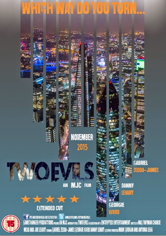
I decided to place a tagline from our trailer at the top of the poster where the film title was originally placed. The tagline was lifted straight from our trailer where it can be seen in the montage with the font/colouring changed in order to the fit the style of my poster. This also links the two products together well creating verisimilitude which is necessary for a movie trailer/poster release.

I've also begun to add the necessities in different places around the poster in order for it to be more visually engaging and also to adhere to the criteria needed for a movie poster.

This is how it is looking thus far. Overall I am pleased with how it is turning out.
MT
No comments:
Post a Comment