The artofthetitle.com website takes the credit and title sequences of movies and
distills them into a wall of stills. Although we are making a trailer rather than a film
opening like we did last year, this site will still be invaluable in terms of aesthetics,
fonts, colouring, and style for our trailer.
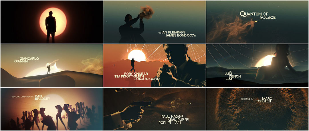
I love the aesthetic of these first two sets of titles, although how applicable they
I love the aesthetic of these first two sets of titles, although how applicable they
are to our project is limited. The use of visual metaphor and bold imagery gives both
sequences impact and memorability. The title card for Quantum of Solace is particularly
bold, and I would like to create something with a similar use of light font on green/blue
backdrop, as well as playing around with similar sand/smoke aesthetics. The vibrancy
is perhaps not strong enough for the tone of colour we hope to adopt, but something
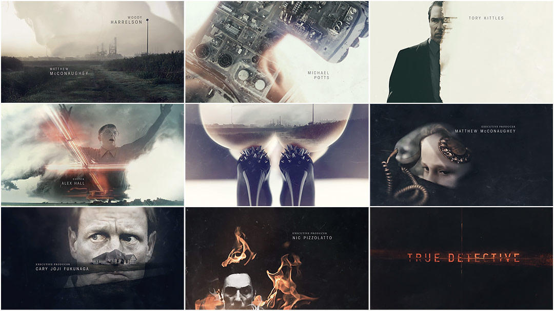
with a brighter blue or stronger green could work. As for True Detective, the use of
iconography is powerful, and certainly something for us to consider in composing our
shots and where the credits are placed.

In terms of colouring, and potentially font, the Fight Club opening credits are
In terms of colouring, and potentially font, the Fight Club opening credits are
a great influence. The biological iconography is unrelated to our trailer, although
the nervous system images are an interesting image for a production or distribution
ident (similar to Paranoiac Productions last year). The bright blues and whites on the
darker blue background images suit our central London settings and the colour tone
we are intending to set in our trailer, as well as being bold and eye-catching and thus
usable in a similar form in our posters or magazines. A similar, but in my opinion less
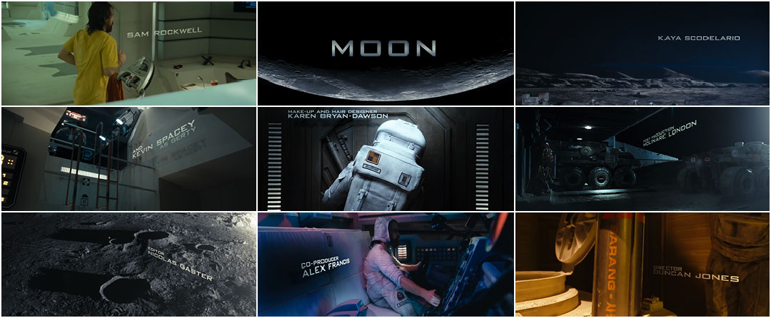
effective, design can be seen in the opening to Moon, which loses some of the
impact of Fight Club due to its inconsistency and weaker font.
The site has provided me with a range of different ideas and influences
The site has provided me with a range of different ideas and influences
about what works and doesn't. For our trailer, bearing in mind genre, tone, and
our planned colour schemes and imagery, there are certain aspects we can draw
from the examples given here, especially in terms of font and backdrop colouring
and juxtaposition.
CM
CM
No comments:
Post a Comment