I wanted to make some of the 'specials' stand out and saw that Empire often added a low opacity box around their 'specials' in order to make them stand out to the readers/audience. I decided to do something similar, as seen below, whereby I created a grey box and lowered the opacity in order for it to stand out in comparison to the background but not crowd out the words above it. I then Layered the text above it and moved it to size. It created the effect that I was looking for, which was pleasing.

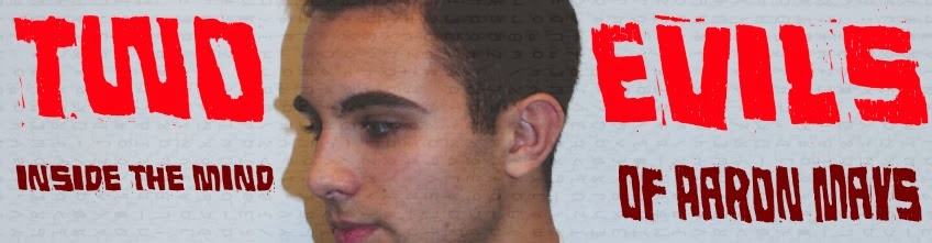
I also decided that I needed to change the colour of my film title slightly and so decided to keep the powerful 'Two' and 'Evils' in bright block red but changed the subtitle to a much darker burgundy. I felt that this balanced the overall look to my magazine, which is essential for it's success.
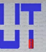
I wanted to add some sort of logo and was set on the idea of using an image of a razor-blade to fit with the 'Extended Cut' masthead. I placed the razor blade image all over the magazine and even attempted to add a line of them through the already visible cut in between the top and bottom layer of 'extended cut'. In the end, I decided to change the colour of the razor-blade and tilt it so it would fit into the 'T' at the end of my magazine title/name.
MT
No comments:
Post a Comment