Influences
North by Northwest
The opening titles of Hitchcock's 'North by Northwest' are the main inspiration for what we would like to do with our title sequence. Our film opens with panning shots of the London skyline, which we would like to place the text onto. This is difficult to do in terms of getting the text to lay over a moving image, and move at the same pace, so we may need to simplify it by laying the text over a still image. This would allow us to make it fit more effectively and would be far simpler to achieve. The effect used in the 'North by Northwest' opening is visually effective and sets the scene as metropolitan. Ours would need to use slightly slower movement and less dramatic music, in order to achieve a more suspenseful feel than the fast paced and exciting 'North by Northwest'.
The opening titles of Hitchcock's 'North by Northwest' are the main inspiration for what we would like to do with our title sequence. Our film opens with panning shots of the London skyline, which we would like to place the text onto. This is difficult to do in terms of getting the text to lay over a moving image, and move at the same pace, so we may need to simplify it by laying the text over a still image. This would allow us to make it fit more effectively and would be far simpler to achieve. The effect used in the 'North by Northwest' opening is visually effective and sets the scene as metropolitan. Ours would need to use slightly slower movement and less dramatic music, in order to achieve a more suspenseful feel than the fast paced and exciting 'North by Northwest'.
Font Influences


In order to achieve the 'Modern Noir' tone that we would like to, we need to use a bold type, so that it will easily show up against our backdrop and be visually strong. Examples 1-4 here are likely too modern and stylized to work with our film, but are successfully bold enough to be very visually effective, especially in their pure colour form. Examples 5-7 are based around Film Noir, and are bold but perhaps too whimsical or tailored for certain films for our use in a more modern film. If we can find a font that has a balance between boldness and stylisation, it will give us a very effective title sequence. (Example 1 is from 'Avengers Assemble', 2 from 'The Hunger Games, 3 from 'Iron Man', 4 from 'Transformers', and 5-7 are all from various font designers that have made their work available for download online).
Still Image Influences
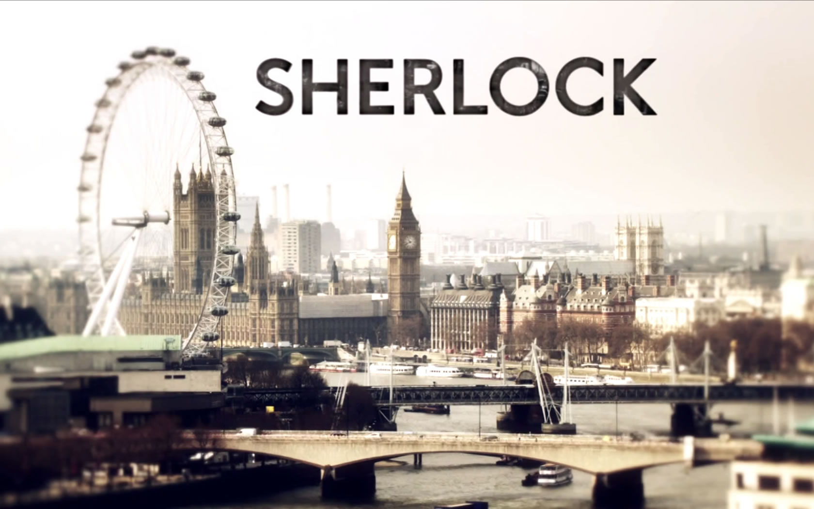
In terms of still imagery, the titles ought to be in a bold, single colour type over strong imagery. The influences here in terms of strength of image are the titles for 'Batman Begins' and 'The Silence of the Lambs', although the latter uses two colours in order for the text to be legible over the complex background. 'The Wrong Mans' titles are a good example of the use of titles interacting with surrounding that we would like to use, with the titles laying flat to the path in the example here. The titles of 'Sherlock' make use of the London setting, as we would like to do in our film, although we are unlikely to use the London Eye as we will be filming from further away, in order to preserve our dual settings of both a more central London car park and a suburban alleyway.


CM
No comments:
Post a Comment